How to read this chart
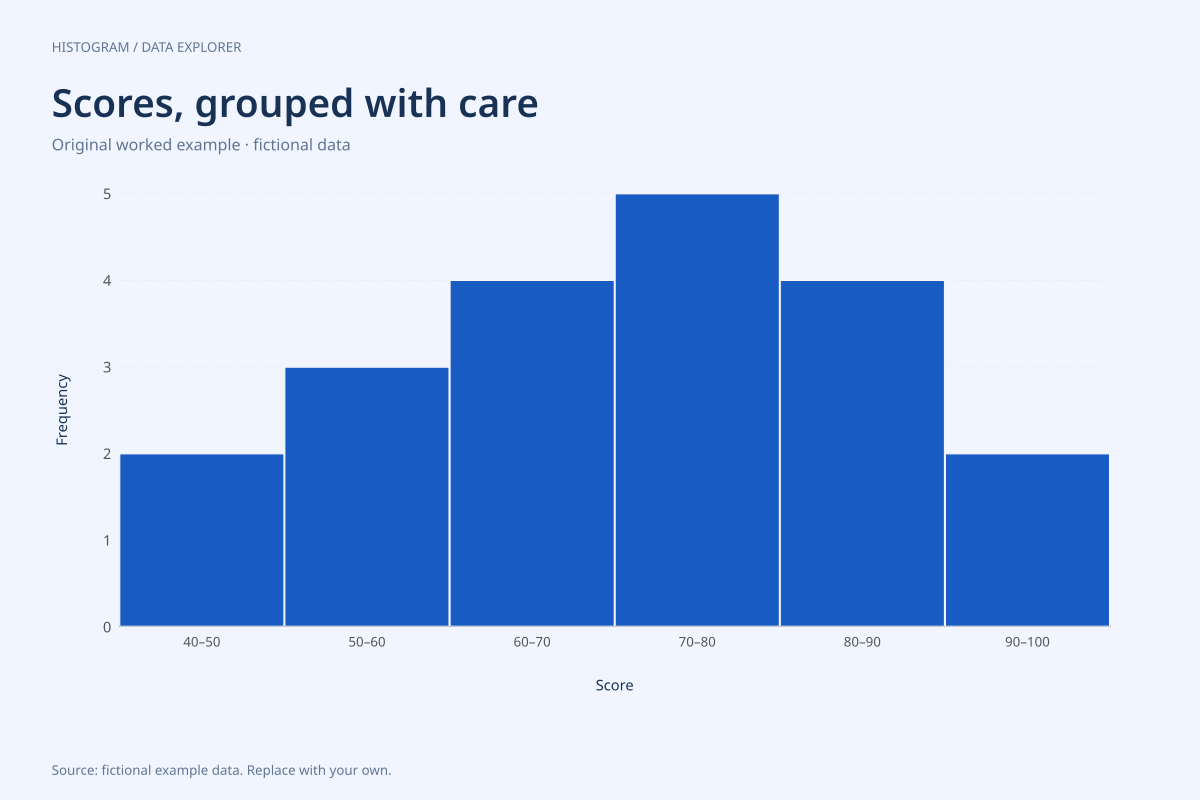
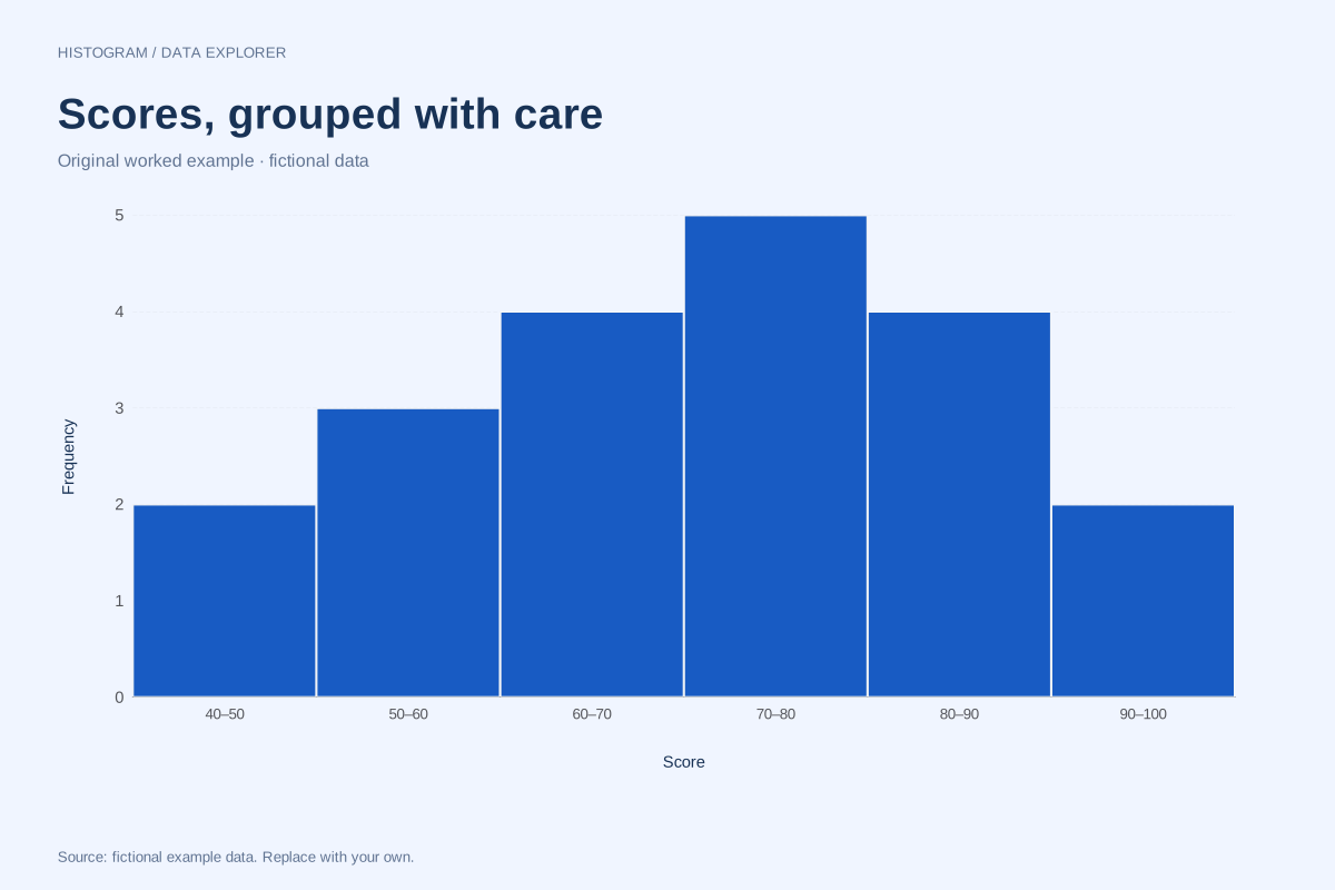
The first interval, 40–under 50, contains 42 and 48. The next has 52, 56 and 58. The remaining bin counts are 4, 5, 4 and 2. Together the six counts sum to twenty, so no score has been lost at a boundary.
The tallest interval is 70–under 80 with five scores. That does not make 70 or 75 the most common exact score: every supplied score occurs once. A histogram describes groups of values, so its tallest bar identifies a modal interval rather than an individual mode.
Try the calculation yourself
Open the editor and change the width from 10 to 20 while keeping the start at 40. The new three counts are 5, 9 and 6. This coarser view emphasizes the centre but hides the differences between adjacent ten-point intervals. Use the width that supports the question and state it when sharing.
Open this exact example, change the data or calculation settings, and compare the result. The CSV preserves the input rows; the ECharts JSON contains drawing options.
What this example cannot tell you
These invented scores do not describe a real class or prove a normal distribution. There are only twenty observations, and the chosen boundaries influence the visual impression.
Why do the bars touch?
Adjacent intervals cover adjacent parts of the numeric scale. The touching bars signal continuous numeric grouping. This is different from a category bar chart, where a gap separates independent category names.
Calculation convention
A histogram counts individual observations inside numeric intervals. Use the bin-count control for an initial equal-width partition, or enter a start and width for boundaries you can explain. Entering a width overrides the count. The chart supports at most 50 bins; it asks you to increase width when the requested range would exceed that limit.
Method background: NIST: histogram definitions and uses.
Created by SupaMakers for ChartsAI · September 8, 2026. Source and reuse terms.