How to read this chart
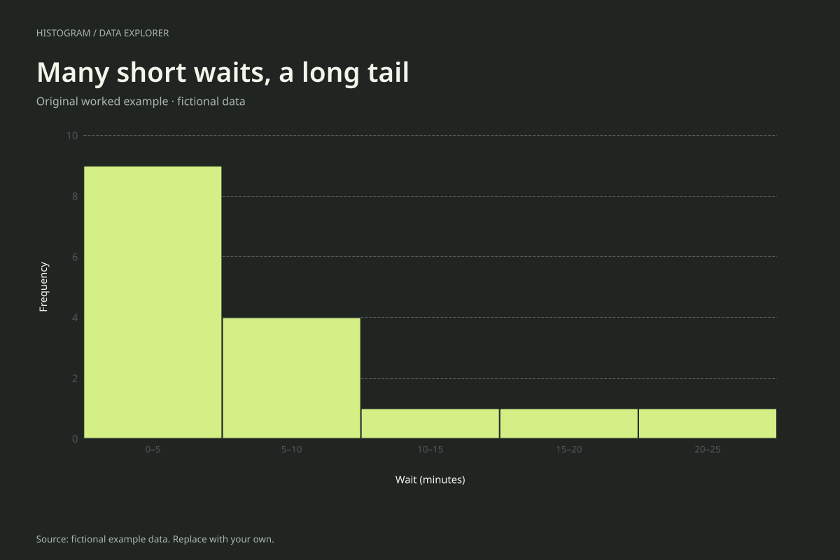
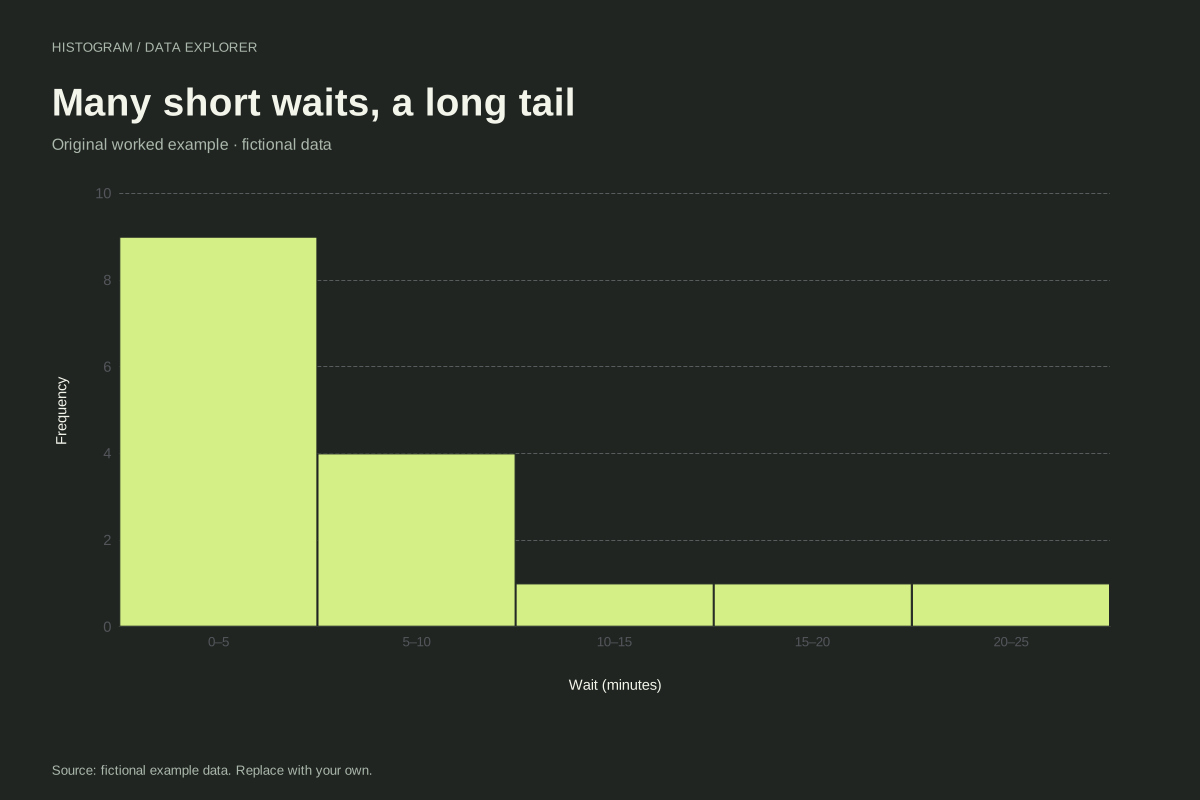
The 0–under 5 interval contains nine observations. The 5–under 10 interval contains four. The next three intervals each contain one observation: 12, 17 and 23 minutes. The counts sum to sixteen, with thirteen waits shorter than ten minutes.
The sample total is 100 minutes, so the mean is 6.25 minutes. The middle two observations are both 4, giving a median of 4 minutes. Longer waits pull the average to the right of the median, but the chart retains those experiences rather than discarding them.
Try the calculation yourself
Compare the five-minute grouping with a width of ten. The first bar then contains thirteen waits, which is easy to summarize but less detailed. To inspect whether one-minute and four-minute waits differ in frequency, download the original values or use a stacked dot plot instead.
Open this exact example, change the data or calculation settings, and compare the result. The CSV preserves the input rows; the ECharts JSON contains drawing options.
What this example cannot tell you
Waiting times are fictional and do not measure a service standard. A long tail in a small sample does not establish a named probability distribution or identify why particular waits took longer.
Should the 23-minute wait be removed?
The picture alone gives no reason to remove it. Investigate source records if a value seems unexpected. Exclusion requires an explicit data decision; this histogram includes all sixteen valid observations.
Calculation convention
A histogram counts individual observations inside numeric intervals. Use the bin-count control for an initial equal-width partition, or enter a start and width for boundaries you can explain. Entering a width overrides the count. The chart supports at most 50 bins; it asks you to increase width when the requested range would exceed that limit.
Method background: NIST: histogram definitions and uses.
Created by SupaMakers for ChartsAI · September 8, 2026. Source and reuse terms.