Histogram examples
Group individual numeric observations into equal-width intervals. Choose a bin count or explicit start and width, inspect every frequency, and switch between counts and percentages. These worked examples make the input values, method and interpretation available together.
Make your own histogram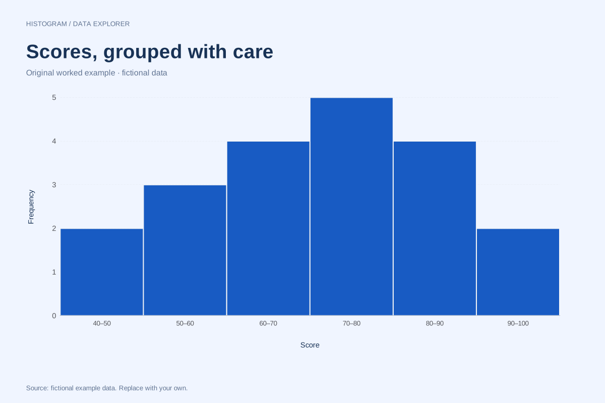
Histogram of class scores with ten-point bins
This histogram groups twenty fictional scores into ten-point intervals from 40 to 100. The count in each interval makes the concentration easier to compare while the downloadable list preserves every original score.
Explore chart & data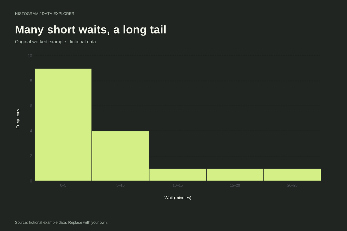
Right-skewed waiting-time histogram
This waiting-time histogram shows a concentration of short waits and a tail toward longer durations. Sixteen fictional observations are grouped into five-minute bins, making both the main cluster and the long waits visible.
Explore chart & data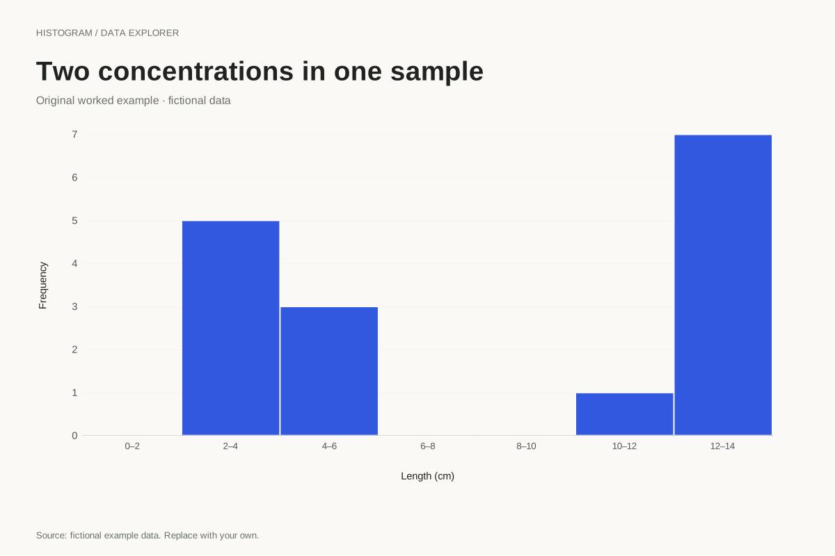
Bimodal histogram example with a gap
This constructed histogram places two clusters of fictional lengths on one numeric scale. The groups lie around 2–5 cm and 11–14 cm, separated by empty intervals that stay visible in the chart.
Explore chart & data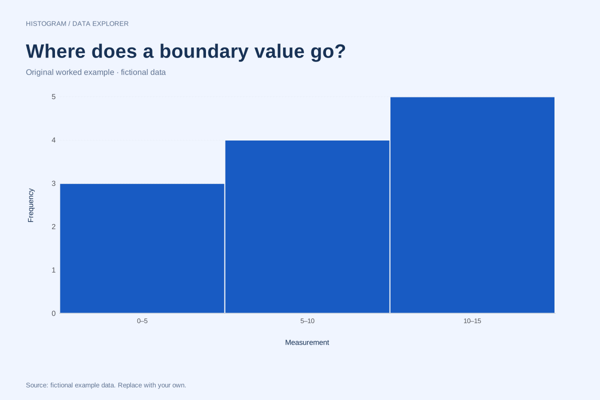
Histogram bin boundaries: where exact endpoints go
A value on a bin boundary must be assigned once. This twelve-observation example makes the boundary convention visible by placing repeated values exactly at 5 and 10, with a final observation at 15.
Explore chart & data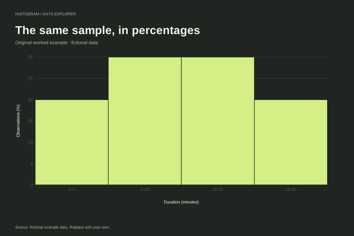
Relative frequency histogram with a worked percentage table
A relative frequency histogram expresses each bin count as a share of all observations. Here twenty fictional values become four bars of 20%, 30%, 30% and 20%, preserving the shape of the count histogram.
Explore chart & data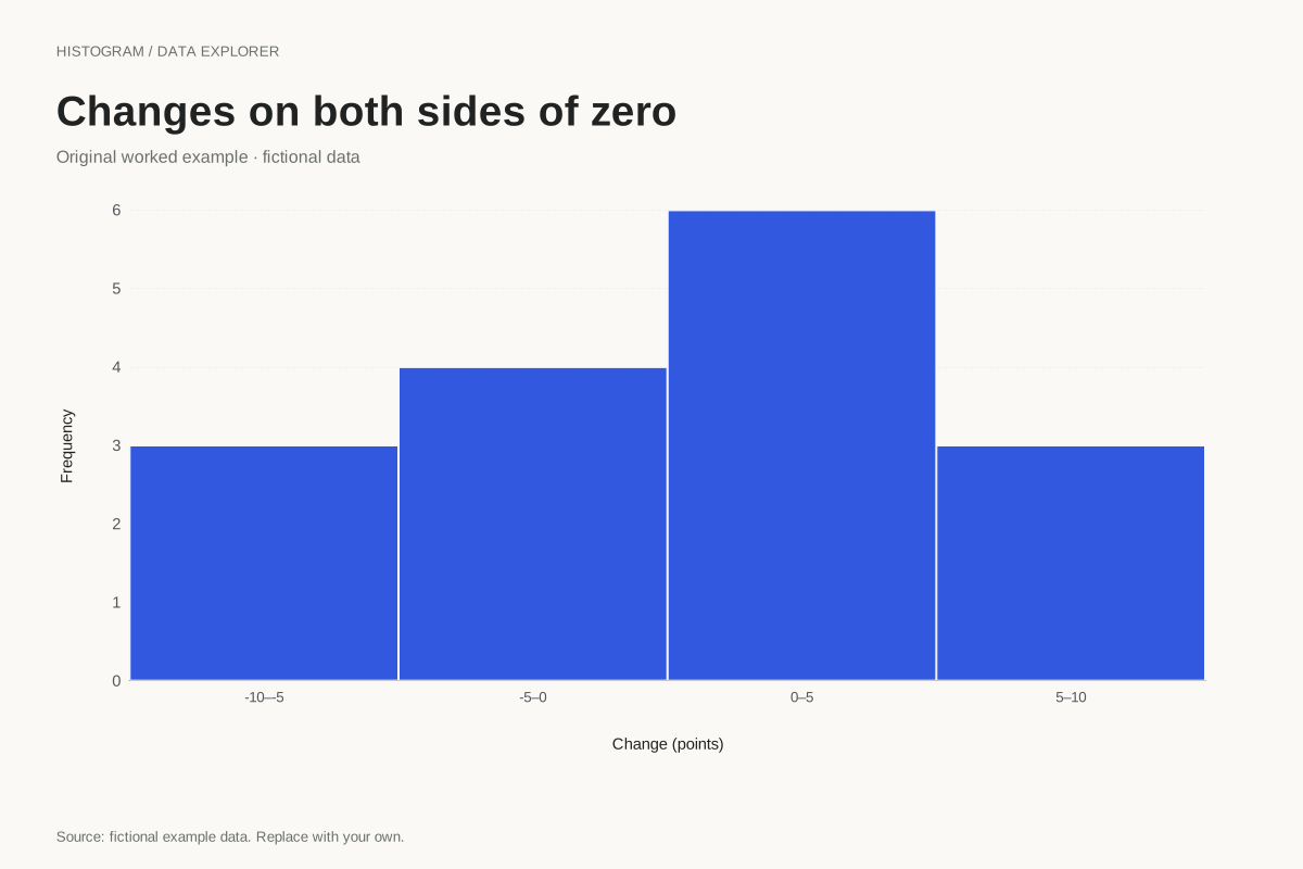
Histogram with negative and positive observations
Histograms can include values below zero. This fictional set represents signed measurement differences, grouped into equal five-unit intervals from −10 to 10. Zero is a value on the axis, not a missing-data code.
Explore chart & dataChoose an example by the question inside the distribution
The score example starts with familiar ten-point intervals and shows how a wider grouping combines counts. Waiting times introduce a long right tail, while the two-peaks example preserves an empty gap between clusters. Use these cases to compare the shape a histogram reveals with the exact observations it groups. Each page includes the full numeric list, so a reader can check whether a visual peak represents repeated exact values or several different values sharing an interval.
Inspect the decisions that change a histogram
The boundary example puts repeated observations exactly on interval endpoints. It is designed to expose whether a rule counts them once. The relative-frequency example changes the vertical measure from counts to percentages without changing boundaries. Signed changes demonstrate that zero and negative observations belong on the numeric scale. Together these cases cover grouping, denominator and sign decisions that are easy to miss when starting from a polished picture.
Adapt a case without inheriting its story
Start with the example closest to your input, open its exact settings, and replace the observation list. A waiting-time title does not make arbitrary numbers waiting-time evidence. Supply the actual units and source, inspect the new bin counts and write a fresh interpretation. If only grouped counts are available, do not paste them as though each count were an individual measurement. The histogram editor expects raw observations and calculates their frequencies.
Every dataset in this collection is original and fictional. Use the examples to learn a calculation or start a chart, and replace the source note when adding your own observations. Explore the complete chart library.