How to read this chart
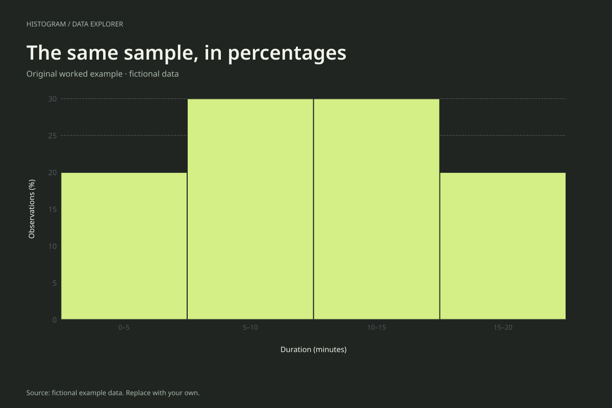
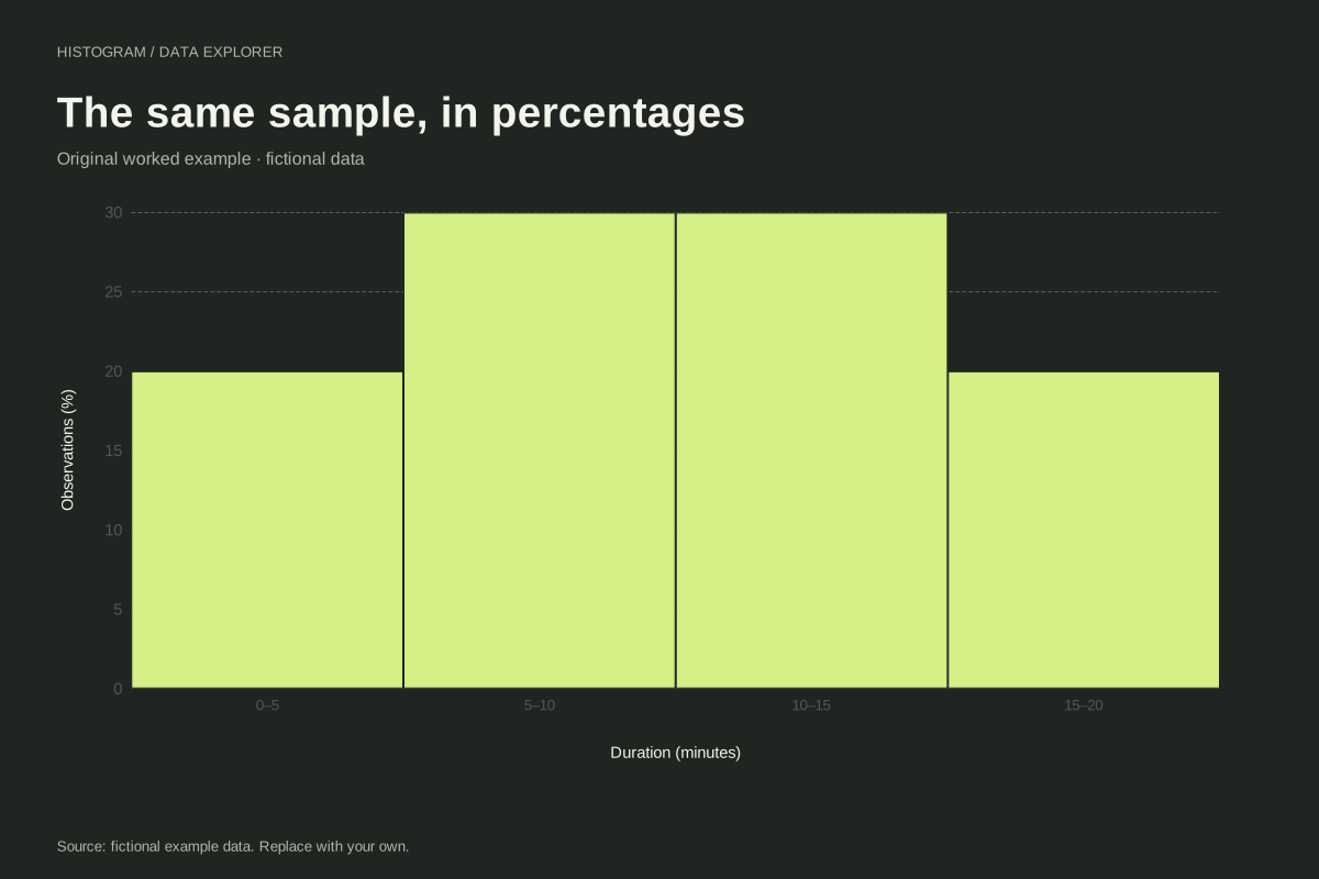
The bins start at 0 with width 5. Their counts are 4, 6, 6 and 4. Dividing each count by 20 and multiplying by 100 gives the displayed percentages. The percentages sum to 100 because every observation belongs to exactly one interval.
The second bin, [5, 10), contains six observations: 5, 6, 6, 7, 8 and 9. The final bin includes 15 through 20, although no observation equals 20. Its count is four. Percentage height describes the interval as a whole, not each individual number inside it.
Try the calculation yourself
Turn relative frequency off to compare counts and percentages using the same bins. The numerical axis changes, but the relative heights remain identical. If comparing two samples with different sizes, use matching boundaries and units before comparing their percentage histograms.
Open this exact example, change the data or calculation settings, and compare the result. The CSV preserves the input rows; the ECharts JSON contains drawing options.
What this example cannot tell you
This plot uses equal-width bins and percentage heights. It is not a density histogram: heights are not divided by bin width. Do not interpret its total geometric area as one or use it to compare unequal-width bins.
Is relative frequency the same as density?
No. Relative frequency is count divided by sample size. Density also divides by interval width so that area encodes probability. With these five-unit bins, a 30% interval has probability 0.30 and density 0.06 per unit.
Calculation convention
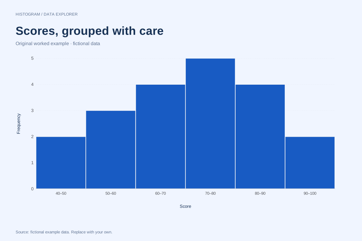
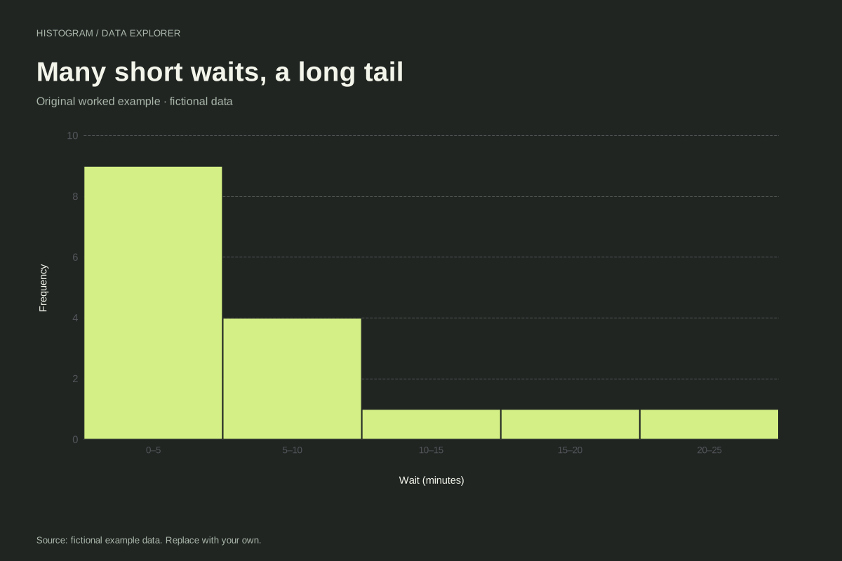
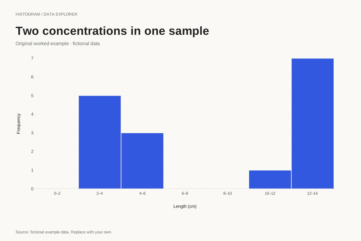
A histogram counts individual observations inside numeric intervals. Use the bin-count control for an initial equal-width partition, or enter a start and width for boundaries you can explain. Entering a width overrides the count. The chart supports at most 50 bins; it asks you to increase width when the requested range would exceed that limit.
Method background: NIST: histogram definitions and uses.
Created by SupaMakers for ChartsAI · September 8, 2026. Source and reuse terms.