The comparison at a glance
| Task | Useful choice |
|---|---|
| Compare departments | Bar graph |
| Track ordered movement | Line graph |
| Compare two periods per region | Grouped bars |
| Show elapsed time gaps | Line with time axis |
Start with the question readers must answer
If readers need to compare regional counts, bars provide a clear length comparison. If they need to follow the direction of monthly change, connected points may be more direct. Connecting unrelated categories such as departments creates an apparent path with no measured progression. A line should have a reason to connect its neighbours.
Two periods do not require a trend line
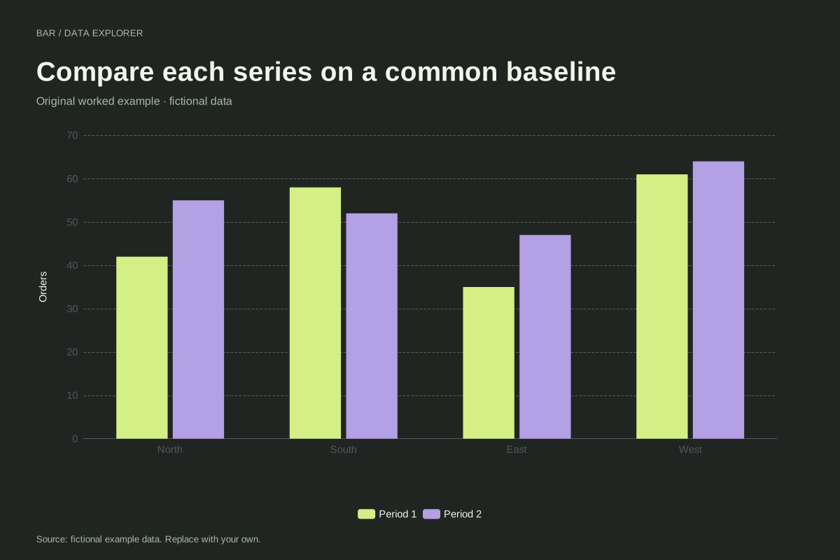
Our regional example compares Period 1 and Period 2 using neighbouring bars. North moves from 42 to 55 while South moves from 58 to 52. Grouped bars allow both comparisons without implying that North, South, East and West form a continuous horizontal variable. The region order is a display choice, not elapsed time.
The baseline affects interpretation
A bar’s visible length encodes its amount, so a zero reference is essential for honest length ratios. A line encodes point positions and can use a tighter scale to reveal small movement, provided the axis is explicit. This is why a scale suitable for a line is not automatically suitable for bars built from the same numbers.
Handle missing periods explicitly
An absent observation is not automatically a zero and does not authorize interpolation. If a report has a missing month, inspect the source and choose a display that explains the gap. ChartsAI flags incomplete numeric input rather than inventing a measurement. For irregularly spaced observations, use a numeric or time axis so horizontal distance has the right meaning.
A related chart you can inspect
References and reproducibility
The worked arithmetic and teaching examples on this page are original. Background reading: ONS guidance on axes. Source code and reuse terms expose the implemented calculations.
Written by SupaMakers for ChartsAI · Reviewed September 8, 2026.
Inspect a sourced time series: NASA temperature record with exact annual values, baseline and publication downloads.