The comparison at a glance
| Aspect | Scatter | Line |
|---|---|---|
| Primary question | Association | Progression |
| Default connections | None | Ordered neighbours |
| Repeated X | Multiple paired observations | Needs a defined sequence |
| Optional fitted line | Model summary | Different from connecting data |
Check what each row means
A row containing height and weight for one item is a pair. Reordering complete rows does not change the scatter coordinates. A row containing a date and a measurement belongs to a sequence; order and spacing can matter to a line. Sorting X and Y independently destroys pairing in either case and can manufacture a relationship.
Repeated X values are a useful test
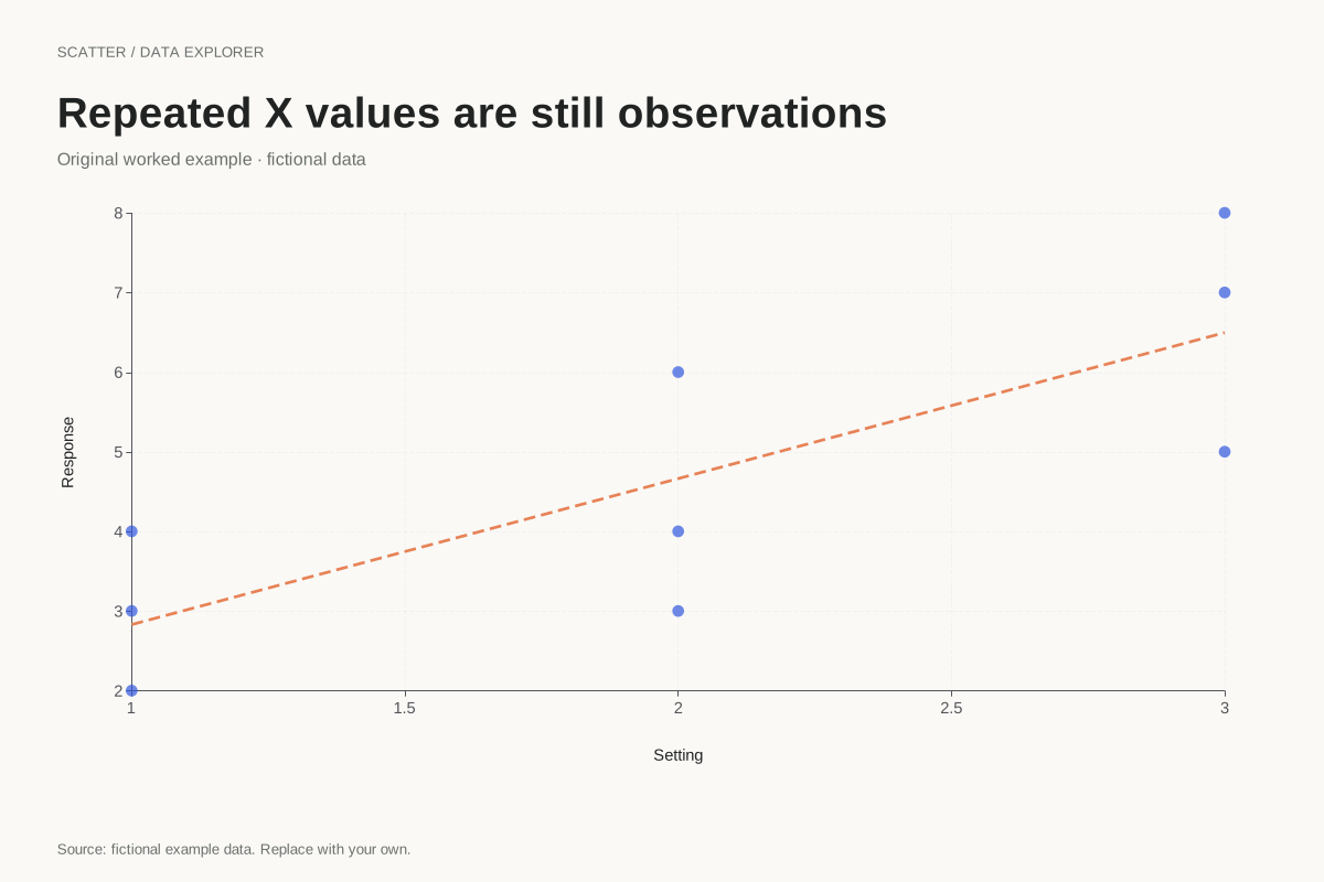
Our repeated-X example has three Y observations at each of X = 1, 2 and 3. The scatter keeps the within-position variation visible. Connecting these rows would create vertical segments and a path determined by arbitrary row order. It would not represent a measured journey or a fitted relationship.
A fitted line is a separate layer
An optional least-squares line summarizes all pairs using a stated calculation. It is not the same as joining consecutive points. The scatter maker draws a fitted line only over the observed X range when X varies. It reports the slope and intercept in a table so a reader can distinguish observations from the model.
Respect numeric and time spacing
A line drawn through dates should use elapsed time when intervals differ. A category axis would give equally spaced positions to unequal gaps. The existing line maker offers numeric and time modes; select the one that matches the meaning of X. A tidy picture cannot compensate for a scale that represents a different question.
A related chart you can inspect
References and reproducibility
The worked arithmetic and teaching examples on this page are original. Background reading: ONS guidance on axes. Source code and reuse terms expose the implemented calculations.
Written by SupaMakers for ChartsAI · Reviewed September 8, 2026.