The comparison at a glance
| Quantity | Meaning |
|---|---|
| r > 0 | Positive linear direction |
| r < 0 | Negative linear direction |
| r = 0 | No sample linear correlation |
| Constant variable | r undefined |
| r² | Squared coefficient; not a causal percentage |
Check the arithmetic on an eight-pair example
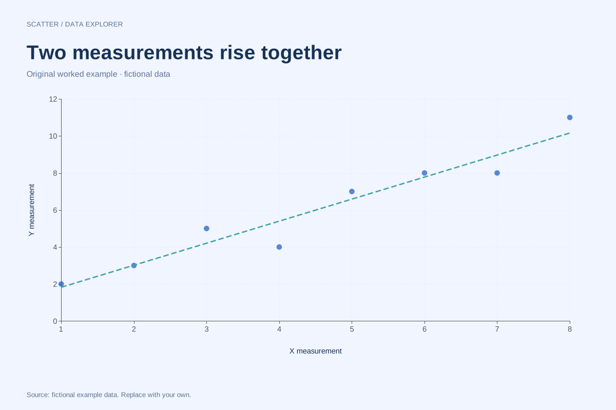
For our positive-association pairs, the centred X-square sum is 42, the centred Y-square sum is 64 and the centred cross-product sum is 50. Therefore r = 50/√(42 × 64). The exact expression gives approximately 0.96440. Keeping the unrounded expression avoids a mismatch caused by rounding intermediate means or sums.
Units and direction play different roles
Changing centimetres to millimetres multiplies one variable by a positive constant and leaves r unchanged. Reversing the sign of one variable reverses the correlation sign. Swapping X and Y leaves r unchanged, although the least-squares slope for predicting Y from X generally differs from the slope for predicting X from Y.
Zero is a limited statement
Our curved example uses Y = X² for symmetric X values from −4 to 4. Positive and negative centred cross-products cancel, giving r = 0 even though the coordinates obey an exact relationship. Always inspect the scatter plot before describing a low r as an absence of structure.
Avoid unsupported labels
There is no universal practical threshold that makes a correlation important in every field. Sample size, measurement quality and purpose matter. The maker reports a descriptive sample r and R² but does not calculate a p-value, confidence interval or causal effect. Repeated and influential observations remain visible in the original data.
A related chart you can inspect
References and reproducibility
The worked arithmetic and teaching examples on this page are original. Background reading: NIST scatter plot background. Source code and reuse terms expose the implemented calculations.
Written by SupaMakers for ChartsAI · Reviewed September 8, 2026.