The comparison at a glance
| Statement | Supported by scatter alone? |
|---|---|
| Points trend upward | Can be a descriptive reading |
| Changing X will raise Y | No |
| No third variable matters | No |
| The relationship holds outside this range | No |
| The data deserve further investigation | A reasonable next step |
Separate the observed pattern from an intervention
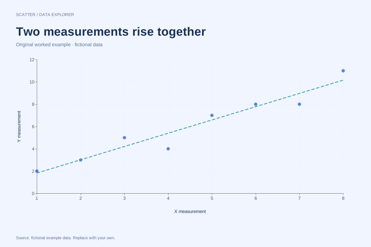
In our fictional positive scatter, larger X generally accompanies larger Y. The fitted slope describes that sample pattern. It does not tell us what would happen if someone deliberately increased X while other relevant conditions stayed comparable. The coordinates contain no assignment mechanism, time ordering or background variables.
A shared driver can create association
As an illustrative scenario, two measures might both rise with the size of an event. Their association could reflect event size rather than one measure directly changing the other. Reverse direction is another possibility: the apparent outcome may influence the proposed cause. Selecting only certain observations can also alter the visible relationship.
A stronger coefficient does not solve the design problem
Even a perfect straight-line relationship is insufficient by itself to identify cause. Likewise, a weak linear correlation can coexist with a meaningful nonlinear relationship. Mathematical strength and causal identification are different questions. The chart is useful for describing pairs and checking assumptions, but it does not contain missing design information.
Write a claim the evidence can support
Describe the direction and shape actually observed, specify the sample and units, and state limitations. If an intervention effect is the goal, define the intervention, outcome and comparison group, then evaluate the study design and possible confounding. The teaching chart below is deliberately fictional and supports no real-world causal recommendation.
A related chart you can inspect
References and reproducibility
The worked arithmetic and teaching examples on this page are original. Background reading: NIST scatter plot background. Source code and reuse terms expose the implemented calculations.
Written by SupaMakers for ChartsAI · Reviewed September 8, 2026.