A ten-unit gap, two very different impressions
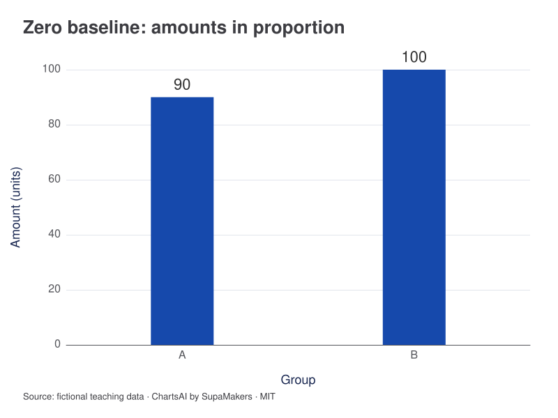
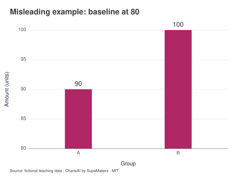
B exceeds A by 10 units, or about 11.1% of A. Starting bars at zero gives a length ratio of 100 ÷ 90 ≈ 1.111. Cropping their visible baseline to 80 gives lengths 10 and 20, a ratio of 2. The right-hand chart is deliberately misleading as an amount comparison.
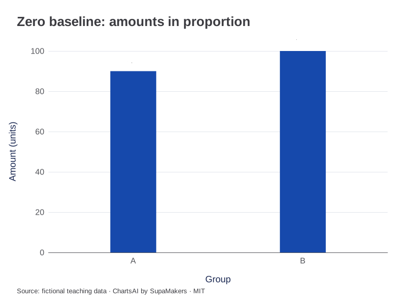
Zero baseline: aligned lengths preserve the ratio between the amounts.
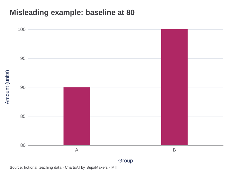
Misleading teaching example: a baseline of 80 doubles visible bar length from 10 to 20. The amounts did not double.
Inspect the original data and method
Identical amounts and upper limit of 100. Only the visible axis minimum changes. The truncated version is a labelled teaching illustration; ChartsAI’s bar maker retains zero. Do not reuse the cropped comparison as evidence that B is twice A.
| Group | Amount (units) |
|---|---|
| A | 90 |
| B | 100 |
Each CSV contains the input for that view. A box-plot CSV adds the same sample label to each observation; it does not substitute quartiles for raw values. Downloaded graphics use the same rendering specification as these previews.
The comparison at a glance
| Values | Baseline | Visible lengths | Length ratio |
|---|---|---|---|
| 90 and 100 | 0 | 90 and 100 | 1.111… |
| 90 and 100 | 80 | 10 and 20 | 2 |
| Difference | Either | 10 units | Unchanged |
Calculate the visual ratio
Suppose two fictional values are 90 and 100. From zero, their bar lengths have ratio 100/90 ≈ 1.111. If the visible baseline is 80, lengths become 10 and 20, with ratio 2. The numerical difference remains ten units, but the shape now suggests a doubling of visible length. That is why the baseline is part of the encoding.
Point position differs from filled length
A line graph locates observations on an axis and connects ordered neighbours. A tighter range can make small differences visible without claiming that the vertical distance from the plot edge represents a total amount. Readers still need clear ticks, units and context, especially when several charts use different scales for comparable measures.
Keep the comparison purpose explicit
If a report asks whether a measurement moved by a few units around a stable level, a clearly labelled close view may be useful. If it asks how large two quantities are relative to one another, a baseline-preserving view is more direct. Showing a full context view alongside a close view can serve both questions without hiding the scale choice.
Use the maker’s defaults deliberately
ChartsAI’s bar maker includes zero for positive amounts and extends to signed values when needed. The line maker has an explicit zero-baseline option. Neither a default nor a visually dramatic result replaces judgement about the claim. Inspect ticks and source values before exporting, and retain a table for readers who need exact differences.
References and reproducibility
The worked arithmetic and teaching examples on this page are original. Background reading: ONS guidance on axes. Source code and reuse terms expose the implemented calculations.
Written by SupaMakers for ChartsAI · Reviewed September 9, 2026.