The same four values on linear and log axes
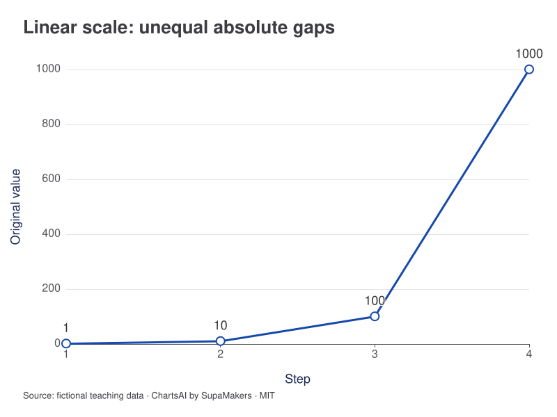
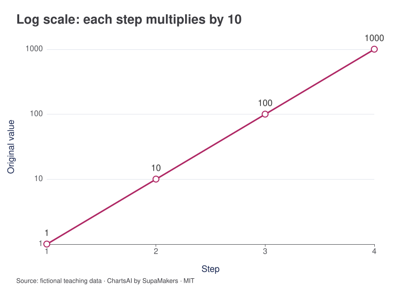
A tenfold increase repeats at every step. The linear view emphasizes the largest absolute increase; the base-10 logarithmic view makes the repeated ratio visible as equal vertical steps. Read the axis labels: equal spacing no longer means an equal number of units.
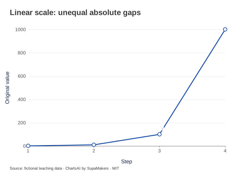
Original-value differences are 9, 90 and 900. No values are transformed in the source table.
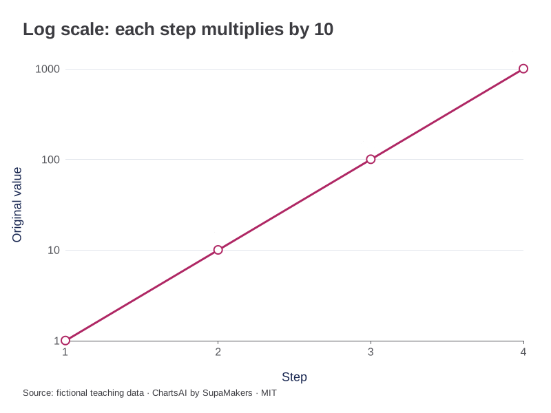
Original-value ticks at 1, 10, 100 and 1,000. Equal spacing means equal ratios.
Inspect the original data and method
The log axis is native ECharts with base 10 and original-value tick labels; the plotted observations remain 1, 10, 100 and 1,000. All are positive. These are downloadable teaching illustrations; the interactive makers do not offer a log-axis control.
| Step | Original value |
|---|---|
| 1 | 1 |
| 2 | 10 |
| 3 | 100 |
| 4 | 1000 |
Each CSV contains the input for that view. A box-plot CSV adds the same sample label to each observation; it does not substitute quartiles for raw values. Downloaded graphics use the same rendering specification as these previews.
The comparison at a glance
| Original value | log10(value) | Ratio from previous |
|---|---|---|
| 1 | 0 | — |
| 10 | 1 | 10 |
| 100 | 2 | 10 |
| 1000 | 3 | 10 |
Compare a simple four-value sequence
The fictional values 1, 10, 100 and 1,000 have base-10 logarithms 0, 1, 2 and 3. They are equally spaced on a log axis because each value is ten times the previous one. On a linear axis their successive gaps are 9, 90 and 900, making the largest increase visually dominate.
Read the question implied by distance
A move from 2 to 4 and a move from 20 to 40 both double the value. They span the same log distance but different linear distances. A logarithmic view can help compare multiplicative growth across very different levels. A linear view is more direct when absolute changes are the decision measure.
Do not hide incompatible observations
The logarithm of zero is not finite, and negative values do not have an ordinary real logarithm. Dropping such rows or adding a constant changes the dataset or transformation. If an alternative transformation is used, name it and explain how values near zero behave. A log axis is not a cosmetic setting that applies meaningfully to every list.
Current tool support and a safe next step
ChartsAI’s interactive makers currently use linear numeric axes; this guide does not claim a log-axis control exists. The table supplies the exact transformation for this worked sequence. If plotting transformed values in a linear maker, label the axis log10(value) and retain the original values separately. That produces transformed coordinates, not automatically an axis with original-value tick labels.
References and reproducibility
The worked arithmetic and teaching examples on this page are original. Background reading: ONS guidance on axes. Source code and reuse terms expose the implemented calculations.
Written by SupaMakers for ChartsAI · Reviewed September 9, 2026.
Inspect a sourced time series: NASA temperature record with exact annual values, baseline and publication downloads.