How to read this chart
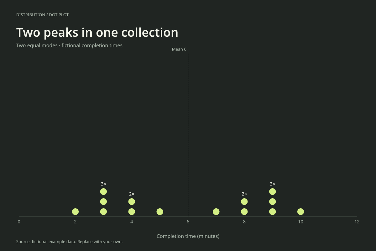
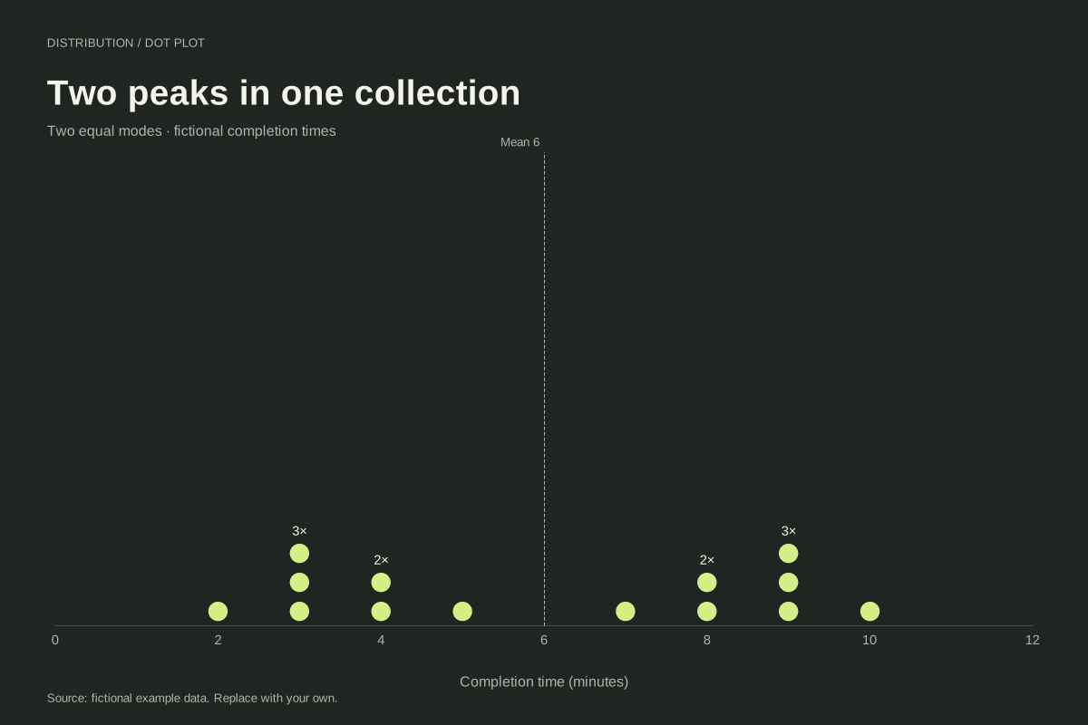
The values are 2, 3, 3, 3, 4, 4, 5, 7, 8, 8, 9, 9, 9 and 10 minutes. Both 3 and 9 occur three times, making them the two modes. No other value occurs as frequently.
The 14 observations sum to 84, giving a mean of 6 minutes. The seventh and eighth sorted values are 5 and 7, so the median is also 6. Yet nobody in the example completed the task in exactly 6 minutes. The shared mean and median conceal the two concentrations.
Build it with your own data
Retain exact repeated observations and use a numeric axis. Do not replace the individual times with a precomputed frequency column when loading this stacked-dot editor. It builds the stacks from the repeated values itself.
Read the modes from stack heights, then compare them with the mean reference. If a real dataset shows two concentrations, examine relevant source information such as task type or collection conditions. Keep any proposed explanation separate from what the chart alone establishes.
Open this example in the dot plot maker Replace the data, inspect the preview and download your version. SVG, PNG and PDF exports are available in the editor.
What this example cannot tell you
Two peaks do not prove there are two underlying populations, and this chart contains no labels identifying groups. The fictional example was designed to have equal modes. Rounding and small sample size can create or hide peaks in real measurements.
Can a bimodal dataset have its average in an empty gap?
Yes. The mean is a calculated balance point, so it does not have to equal an observation. Here both mean and median are 6 while the observations jump from 5 to 7. Reporting the modes and showing the dots preserves information the average leaves out.
Created and reviewed by SupaMakers for ChartsAI · September 8, 2026. Source code and reuse terms.