How to read this chart
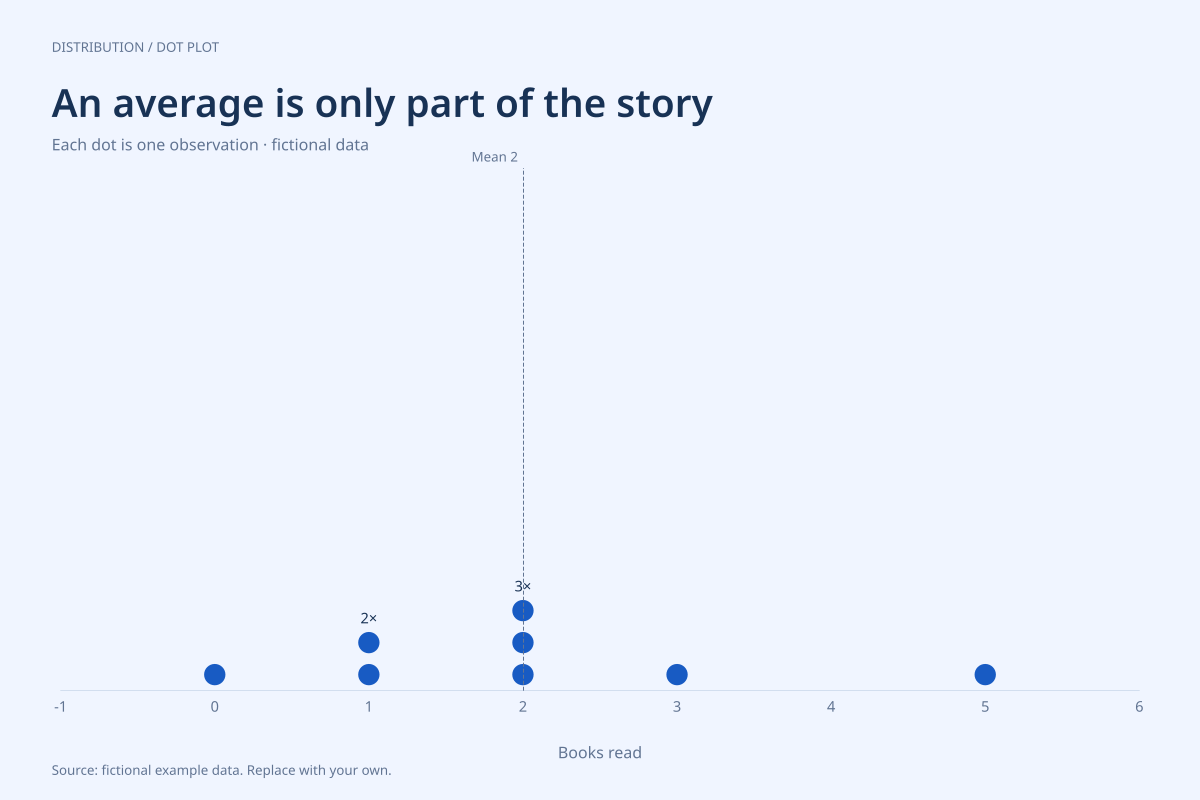
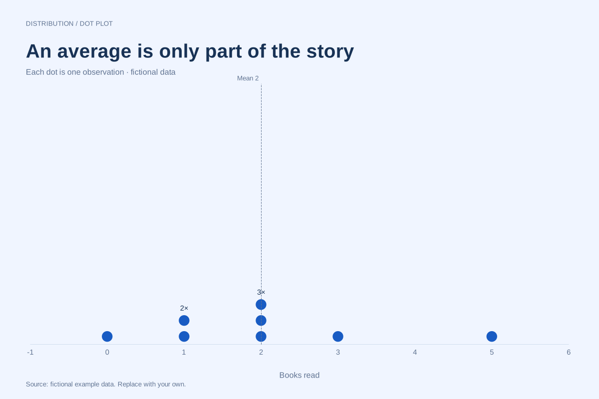
The sum is 16 books across 8 observations, so the mean is 16 ÷ 8 = 2. The middle positions in the sorted list are the fourth and fifth observations; both are 2, so their average and the median are also 2.
The mode is 2 because three dots are stacked there, more than at any other value. The person with zero books still counts as an observation. The shared mean, median and mode in this small dataset do not mean every person read two books.
Build it with your own data
Provide one value per person or observation, including real zeros and repeated values. The vertical dashed reference marks the arithmetic mean. Read the median from the ordered observations; the dashed line is not a separate median marker.
To compare sensitivity, imagine removing the value 5: the remaining total is 11 across 7 observations, and the mean becomes about 1.57 while the median remains 2. That is a teaching comparison, not a reason to delete a legitimate observation from a real dataset.
Open this example in the dot plot maker Replace the data, inspect the preview and download your version. SVG, PNG and PDF exports are available in the editor.
What this example cannot tell you
These are invented whole-number counts over an unspecified example period. They are not reading targets or population estimates. The mean describes a balance point, not necessarily a value observed in other datasets; a median can also fall between two observed values.
Why can the mean and median match when the dots are not perfectly symmetric?
They measure different properties. This particular sum produces a mean of 2 and the two middle values also produce 2. Their equality alone does not prove symmetry, normality or any distributional model, especially with only eight observations.
Created and reviewed by SupaMakers for ChartsAI · September 8, 2026. Source code and reuse terms.