How to read this chart
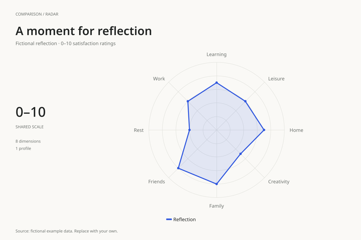
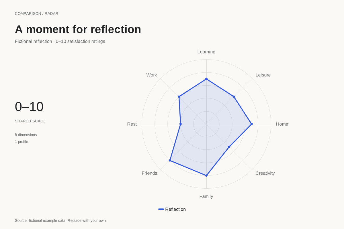
Friends and family have ratings of 8, while rest has a rating of 4 and creativity a rating of 5. Learning and home are at 7; work and leisure are at 6. These values describe the invented profile used to demonstrate the layout.
A lower score can become a prompt for a specific question, such as what would make rest feel more satisfactory. It does not automatically establish a problem, a priority or a need to make every dimension equal. Different areas can matter differently at different times.
Build it with your own data
Rename the eight dimensions to fit your reflection and define the endpoints of the rating scale in your own words. Enter one rating per dimension. Keep the maximum at 10 if you want the existing scale, and update the title and source before downloading.
This is a connected radar polygon with a circular grid, rather than a printable worksheet with independently shaded wedge sectors. You can export it for a journal or revisit the same dimensions later. Keep axis order and rating meanings consistent if comparing reflections over time.
Open this example in the radar chart maker Replace the data, inspect the preview and download your version. SVG, PNG and PDF exports are available in the editor.
What this example cannot tell you
The wheel is a reflection aid, not a diagnostic instrument or a validated measure of wellbeing. Its polygon area is not an overall life score. The example’s numbers are fictional, and a chart cannot determine what choices or support are appropriate for an individual.
Do all parts of the wheel need to reach ten?
No target is prescribed here. The ratings are prompts for your own interpretation, and priorities can change. Consider what each dimension means to you and whether one small, specific adjustment would be useful, rather than treating a perfectly full shape as a requirement.
Created and reviewed by SupaMakers for ChartsAI · September 8, 2026. Source code and reuse terms.