How to read this chart
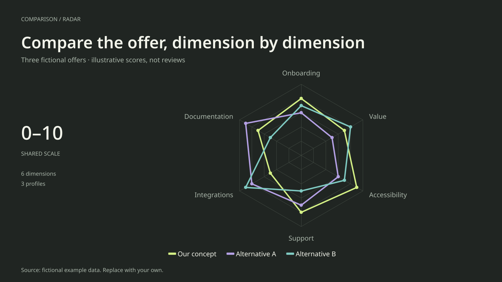
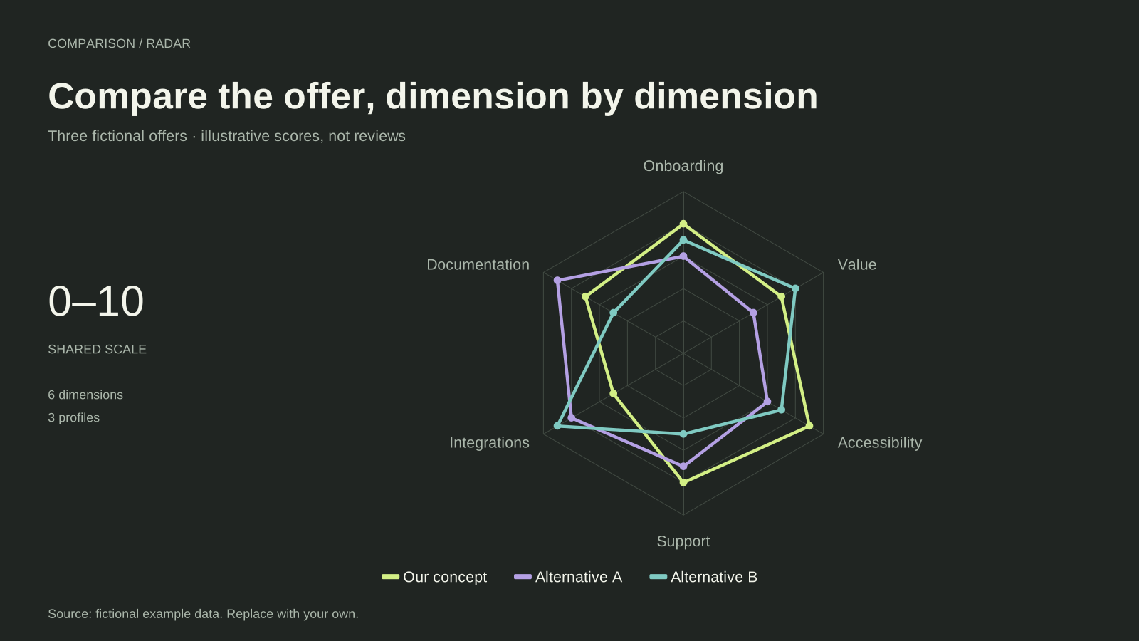
Our concept has the highest supplied ratings for onboarding, support and accessibility. Alternative A leads documentation at 9, while Alternative B leads integrations at 9 and value at 8. The example deliberately distributes strengths across the three profiles.
Our concept’s integration rating is 5, compared with 8 and 9 for the alternatives. That difference could prompt further research in a real comparison. It is not evidence of a market opportunity here because the offers and their scores were invented to explain the chart.
Build it with your own data
Build an evidence table before assigning real scores. Define each criterion, record the source and date, and explain the mapping from observed features or tests to a common 0–10 rating. Use the same evaluation procedure for your own offer and alternatives.
The chart uses outlines and a wide frame to reduce overlap among three profiles. Keep labels short and criteria distinct. If a rating is unknown, investigate or change the comparison scope rather than entering zero: zero is a score, not a missing-data marker.
Open this example in the radar chart maker Replace the data, inspect the preview and download your version. SVG, PNG and PDF exports are available in the editor.
What this example cannot tell you
These are hypothetical offers and illustrative scores, not independent reviews. The profile does not include criterion weights or calculate a winner. Changing axis order changes the polygon shape, and combining overlapping criteria can overemphasize one aspect of an offer.
Should our product be highest on every axis?
Only show ratings supported by the stated evaluation. A useful comparison explains trade-offs and makes its evidence inspectable. Designing the scores to guarantee a favourable shape would undermine the resource’s value and the credibility of the publisher.
Created and reviewed by SupaMakers for ChartsAI · September 8, 2026. Source code and reuse terms.