Class scores
Forty-eight fictional scores. Each dot represents one student; stacked dots show repeated scores.
Use this exampleSample CSVUpload a CSV or Excel file, or paste your numbers. Choose a column, preview your dot plot, and download it free.
Each dot is one value. Repeated values stack up.
Editorial stylePNG for slides · SVG for editing · PDF for printing
| Value | Frequency | Share of observations |
|---|---|---|
| 52 | 1 | 2.083333% |
| 56 | 1 | 2.083333% |
| 60 | 2 | 4.166667% |
| 64 | 3 | 6.25% |
| 68 | 4 | 8.333333% |
| 72 | 5 | 10.416667% |
| 76 | 7 | 14.583333% |
| 80 | 8 | 16.666667% |
| 84 | 6 | 12.5% |
| 88 | 5 | 10.416667% |
| 92 | 3 | 6.25% |
| 96 | 2 | 4.166667% |
| 100 | 1 | 2.083333% |
Original examples with fictional data.
The starting point is yours to change.
Forty-eight fictional scores. Each dot represents one student; stacked dots show repeated scores.
Use this exampleSample CSVFourteen fictional deliveries. The seven-day delivery stays visible instead of being removed as an outlier.
Use this exampleSample CSVTwelve fictional readers. Zero is a real observation here; it is different from an empty cell.
Use this exampleSample CSVA frequency dot plot places one dot above a number line for each observation. Repeated values stack vertically, so you can see which values occur most often while keeping every observation visible.
Use a dot plot for a small numeric dataset: class scores, counts, waiting times or measurements. Unlike a histogram, it does not group your values into bins. This tool makes frequency dot plots, rather than Cleveland dot plots for comparing categories.
How we handle data & calculationsType a list, paste spreadsheet cells, or import CSV or Excel. Choose your numeric column in the preview.
Add a title and axis label, choose a color, and optionally show the mean. Check the frequency table for exact values.
Download a high-resolution PNG for slides or an editable SVG for design tools. The data is also available as CSV.
Built by SupaMakers.
Updated September 8, 2026.
Yes. Create and download dot plots without an account, payment, or watermark. PNG, SVG, PDF and CSV downloads are included.
Paste a list of numbers or cells copied from Excel or Google Sheets. You can also import CSV, TSV, TXT or XLSX files, select a sheet, and choose the column to plot. The chart supports up to 300 observations.
No. File reading, chart calculations and downloads happen on your device. There is no cloud saving; refreshing the page resets your edits. Download the CSV if you want to reuse the values later.
An empty or invalid value in your selected data is flagged for correction. It is not replaced with zero. Outliers and duplicate values are retained; duplicates form stacks.
The mean is the sum of the observations divided by their count. The median is the middle sorted observation; for an even count it is the average of the two middle observations. The range is the maximum minus the minimum.
A dense set of measurements may be easier to read as a histogram. To compare two numeric variables, use a scatter plot. For category totals, a bar chart is usually more suitable. This tool preserves values rather than rounding them into groups.
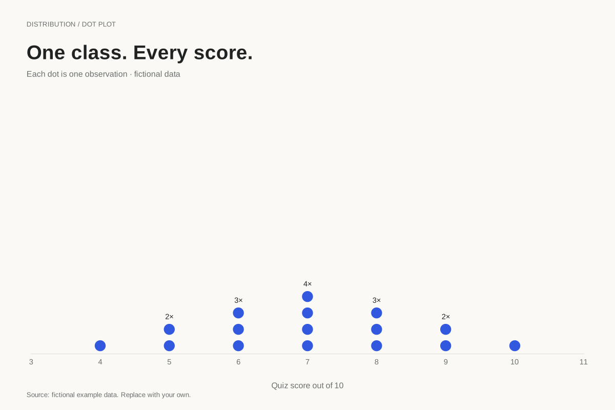
A stacked dot plot places one dot for each observation above its numeric value. This example shows all 16 fictional quiz scores on a ten-point scale, so repeated scores are visible as taller stacks.
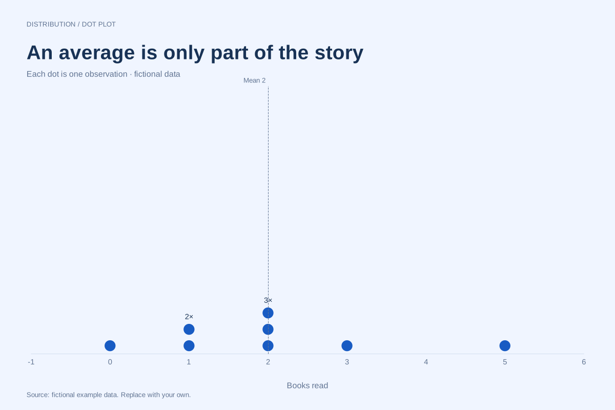
Editable chart + original dataA dot plot can show the observations behind the mean and median. In this eight-person fictional reading example, the values are 0, 1, 1, 2, 2, 2, 3 and 5 books: both the mean and median are 2.
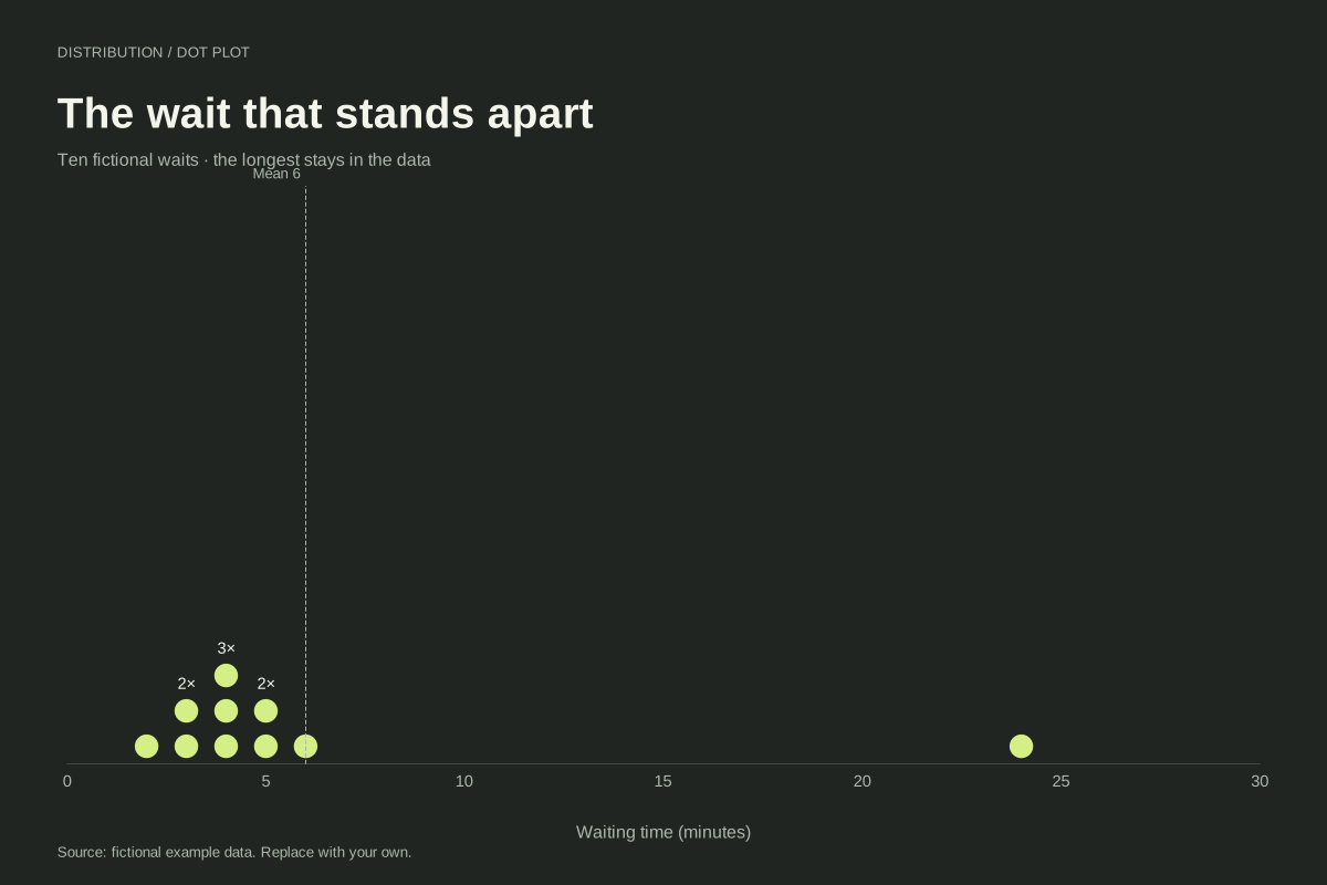
Editable chart + original dataA dot plot keeps an unusually large observation visible beside the rest of a dataset. Here nine fictional waits lie between 2 and 6 minutes, while one wait lasts 24 minutes. All ten observations remain in the chart.
Editable chart + original dataTry free dot plot worksheets with answers, with editable data and printable practice packs.