Team skills
Fictional self-assessments on the same 0–10 scale. These are illustrative scores, not validated measures.
Use this exampleSample CSVUpload a CSV or Excel file, or paste your scores. Choose the dimensions, series and shared scale, then preview and download your radar chart.
Compare scores along matching axes. The shape is a profile, not an overall score.
Editorial stylePNG for slides · SVG for editing · PDF for printing
A shape shows a profile, not an overall score. The order of the axes changes the shape; compare values along matching axes.
Original examples with fictional data.
The starting point is yours to change.
Fictional self-assessments on the same 0–10 scale. These are illustrative scores, not validated measures.
Use this exampleSample CSVFictional ratings with higher consistently meaning better. Raw prices and ratings should not share a scale.
Use this exampleSample CSVFictional personal reflections, not health measurements. Compare like-for-like questions on the same scale.
Use this exampleSample CSVA radar chart, also called a spider chart, places several quantitative dimensions on axes around a common center. Each series connects its scores into a polygon, making it possible to compare profiles across matching dimensions.
Use a radar chart when the dimensions have comparable scales and a consistent direction. For example, five ratings from zero to ten can share a chart. Raw prices, percentages and delivery days should not share a scale without a clearly explained transformation.
Further reading: Data to Viz explains radar-chart caveats
How we handle data & calculationsStart with team skills, product ratings or a weekly reflection. Replace the sample names, dimensions and scores.
Choose a shared maximum and check that all scores fit. The editor flags missing, negative or out-of-range values.
Download PNG for a presentation or SVG to keep editing. Save the CSV to reuse the names and scores.
Built by SupaMakers.
Updated September 8, 2026.
Yes. Radar chart, spider chart and web chart commonly describe the same multi-axis visualization. You can create all of them with this editor.
Yes. Use one to five series, each with scores for the same three to ten dimensions. Every series uses the same axis order and shared zero-to-maximum scale.
Yes. Import CSV or Excel, select the column naming your dimensions, then choose your score columns. You can swap rows and columns in the preview. Use consistent units and check the scale after importing.
Not necessarily. The shape and enclosed area depend on the ordering of the axes as well as the scores. Compare values on matching axes; do not treat the polygon area as an overall rating.
This version uses one shared maximum. If your dimensions have different units, transform them to a common scale yourself and label the method clearly, or choose another chart. The tool does not normalize values silently.
Yes. PNG, SVG, PDF and CSV downloads have no account requirement or watermark. Your entered values and imported files are processed in the browser and are not sent to a server.
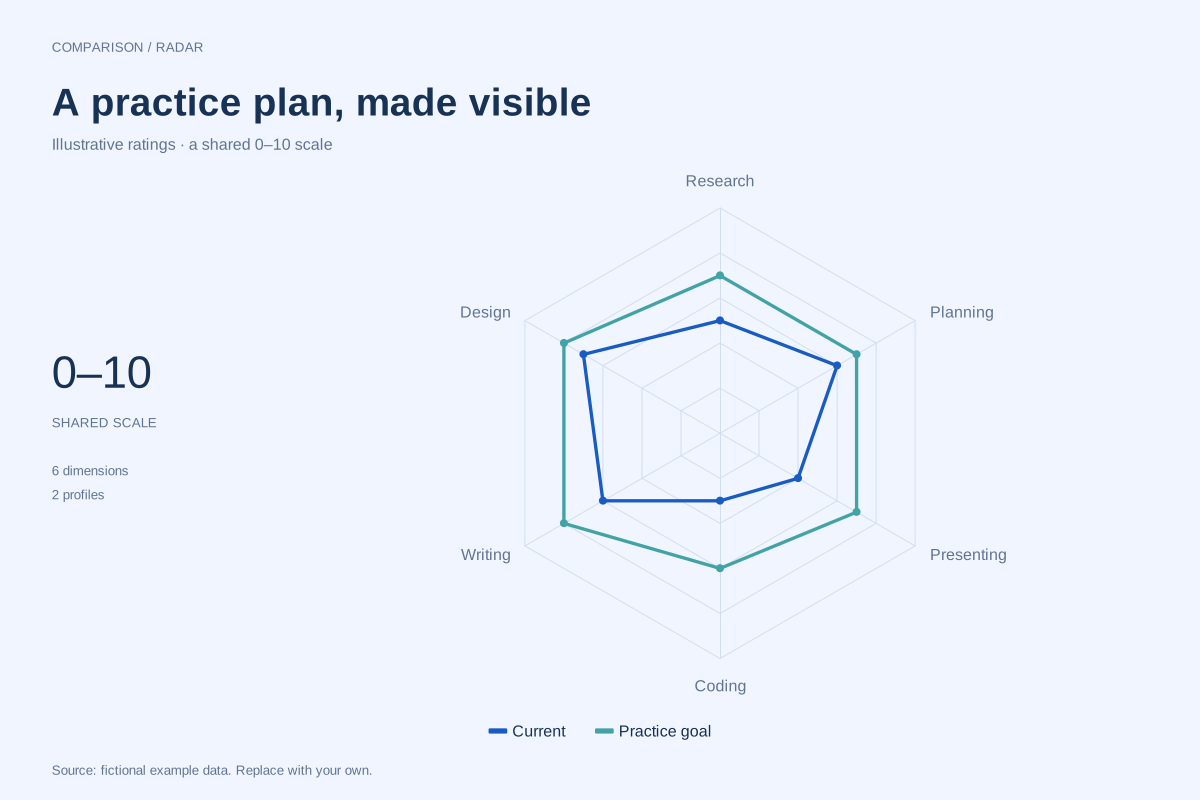
A skills radar chart compares ratings across several named capabilities on a common scale. This fictional example places current self-ratings beside practice goals for six skills, making the gaps available for discussion.
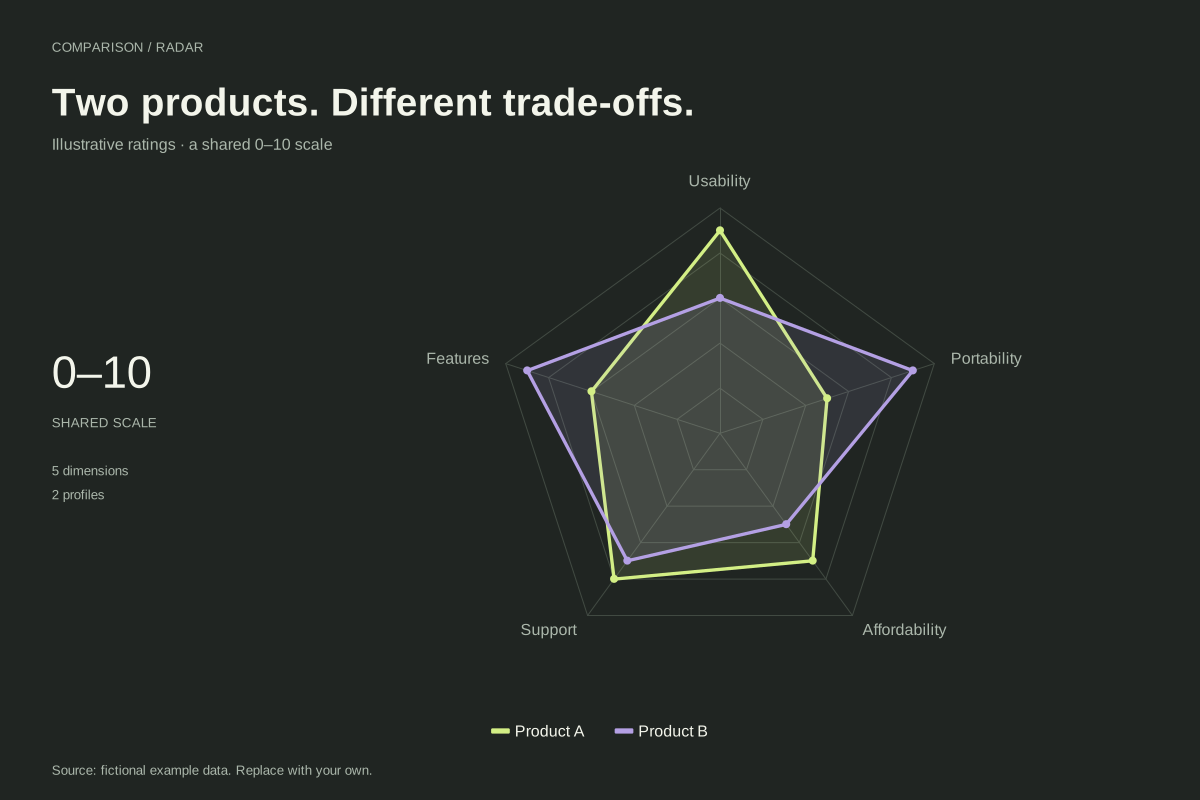
Editable chart + original dataA product comparison radar chart displays two products across a shared set of rated criteria. This fictional example compares usability, features, support, affordability and portability on a common 0–10 scale.
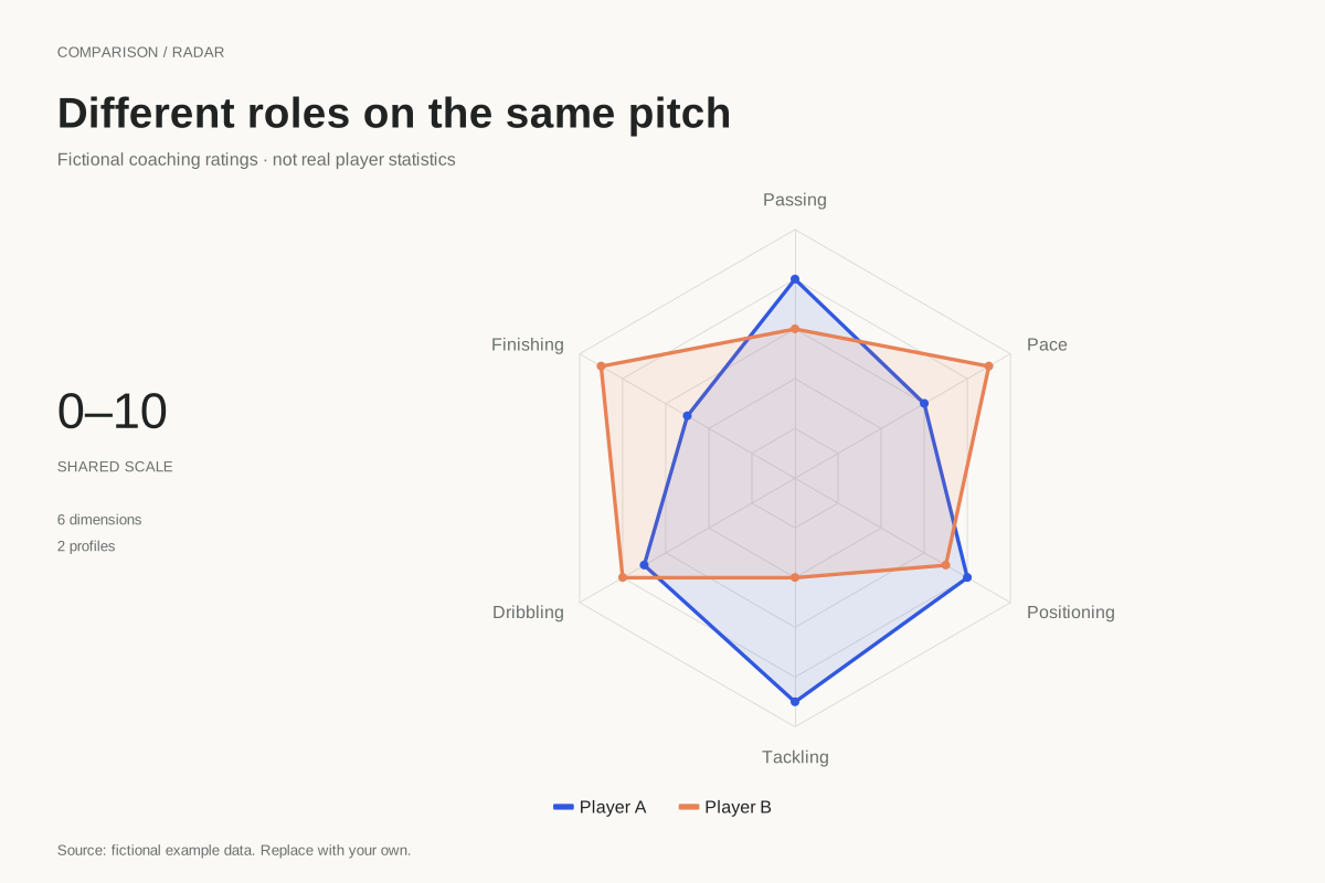
Editable chart + original dataA football radar chart compares profiles across named dimensions. This example uses fictional coaching ratings for two players across passing, finishing, dribbling, tackling, positioning and pace, all on a shared 0–10 scale.
Editable chart + original data