Student sheets
Three pages, twelve questions, room to work. Answers stay in a separate file.
A4 student PDFLetter student PDFPractice reading individual observations, counting stacked dots and drawing a dot plot from a data list. Download a ready-made worksheet with answers, or replace the data to make your own.
A complete lesson · Free to reuse
Three short lessons on distributions, averages and histogram bins. Download student sheets separately from the worked answer key. No signup.
Three pages, twelve questions, room to work. Answers stay in a separate file.
A4 student PDFLetter student PDFThree pages with calculations and explanations. Print or share separately.
A4 answer key PDFLetter answer key PDFAllow about 35 minutes; adapt to your learners. Prerequisites: number lines, addition and division.
Teacher notes and reuse licenseRead the lessons online ↓How to use it: print the student PDF at 100%; work through the lessons; discuss the key. The ZIP includes both paper sizes, the separate keys, original CSVs, SVG figures and teacher notes. Lessons 1–2 share completion-time data; lesson 3 uses a new waiting-time dataset.
Read frequencies, describe the spread and identify two concentrations.
Count each dot once. The numbers on the horizontal axis are minutes, not frequencies.
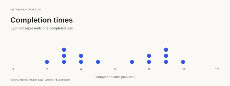
Completion time (minutes): 2, 3, 3, 3, 4, 4, 5, 7, 8, 8, 9, 9, 9, 10. Original fictional practice values.
Bimodal describes two peaks or concentrations. Their heights need not be equal in general; this deliberately constructed sample has two equally frequent modes. Small samples and rounding can change the apparent shape.
Calculate mean and median, then compare those summaries with the distribution.
Use the same completion times as lesson 1. Show your calculation before interpreting it.
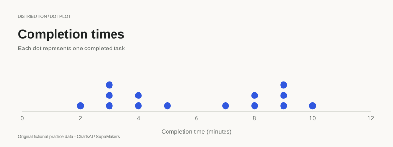
Completion time (minutes): 2, 3, 3, 3, 4, 4, 5, 7, 8, 8, 9, 9, 9, 10. Original fictional practice values.
Mean and median answer different questions. Neither summary alone describes the two concentrations, and neither is automatically the best choice for every dataset.
Distinguish exact-value frequencies from interval counts without changing observations.
New dataset: waiting times. Both plots use all the same waits. Bins start at 0 and have width 5 minutes; include the left edge, exclude the right edge, except the last bin includes its right edge.
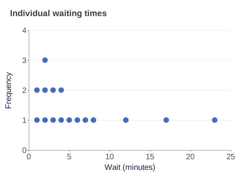
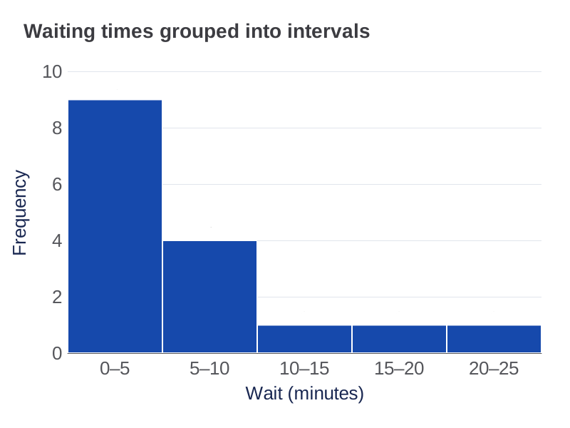
Wait (minutes): 1, 1, 2, 2, 2, 3, 3, 4, 4, 5, 6, 7, 8, 12, 17, 23. Original fictional practice values.
Wider bins can hide gaps or combine concentrations. Do not replace a bin with repeated midpoint values and claim they are the original observations.
The lesson text, original data and exported figures in this teaching pack are available under CC BY 4.0. Credit “ChartsAI by SupaMakers”, link to this page and the license, and indicate changes. The application source uses a separate MIT license.
These examples are constructed for practice, not research findings. We do not claim curriculum certification. The editable charts load the exact original observations; replacing their data does not rewrite this fixed lesson pack. Use the worksheet generator below for questions and answers that recalculate with your data.
Method references: NIST measures of location and NIST histogram background. The text above provides the underlying values and answers; PDF charts are images, while PDF question and answer text is selectable.
Fictional practice data. 18 observations.
Select one column containing 8–40 whole-number observations.
Question page · Print at actual size (100%). Updating preview…
Books read in a month · Books. Each dot represents one observation. Repeated values remain.
Observations: 7, 2, 7, 5, 0, 1, 0, 8, 6, 2, 2, 8, 1, 3, 1, 1, 4, 1
Question downloads always hide answers, even when you preview the key. PDFs contain high-resolution page images.
A dot plot places one dot above each observed value on a number line. Repeated values stack vertically. Horizontal position shows the value; stack height shows how often it occurs.
Use 8–40 whole-number observations between −10 and 30, spanning at most 20 units, with no more than 12 repeated values at one position. Fractions and larger datasets belong in the general dot-plot maker.
Original fictional examples. Each PDF contains one question page and one answer-key page. Download without signing in or enabling JavaScript.
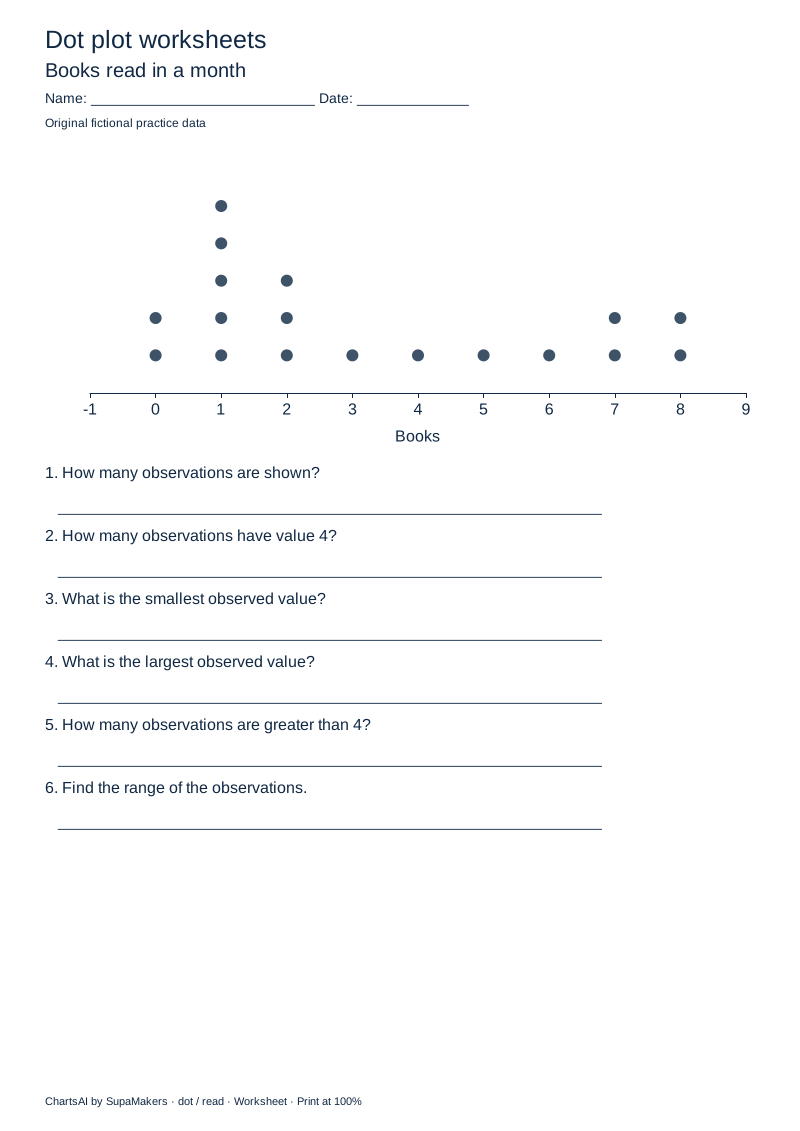
Count observations, read individual values and find the range. Six questions introduce position and frequency.
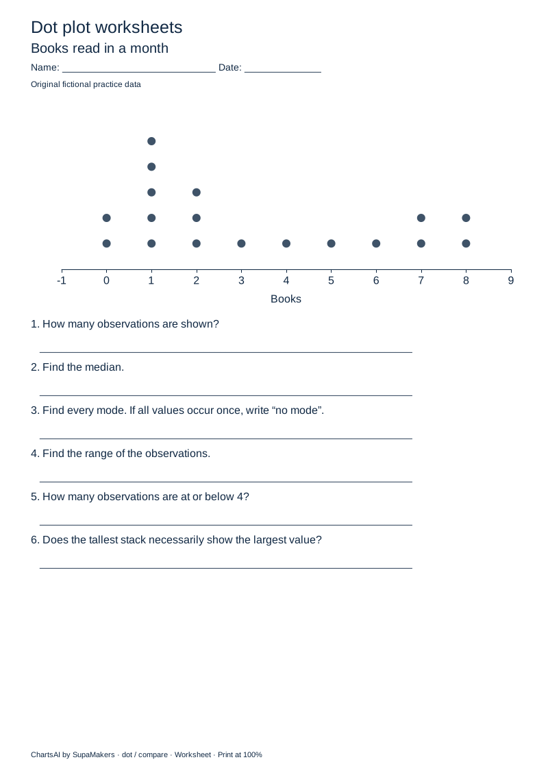
Find median, identify all modes, compare frequencies and explain what a stack means. Six questions include worked reasoning.
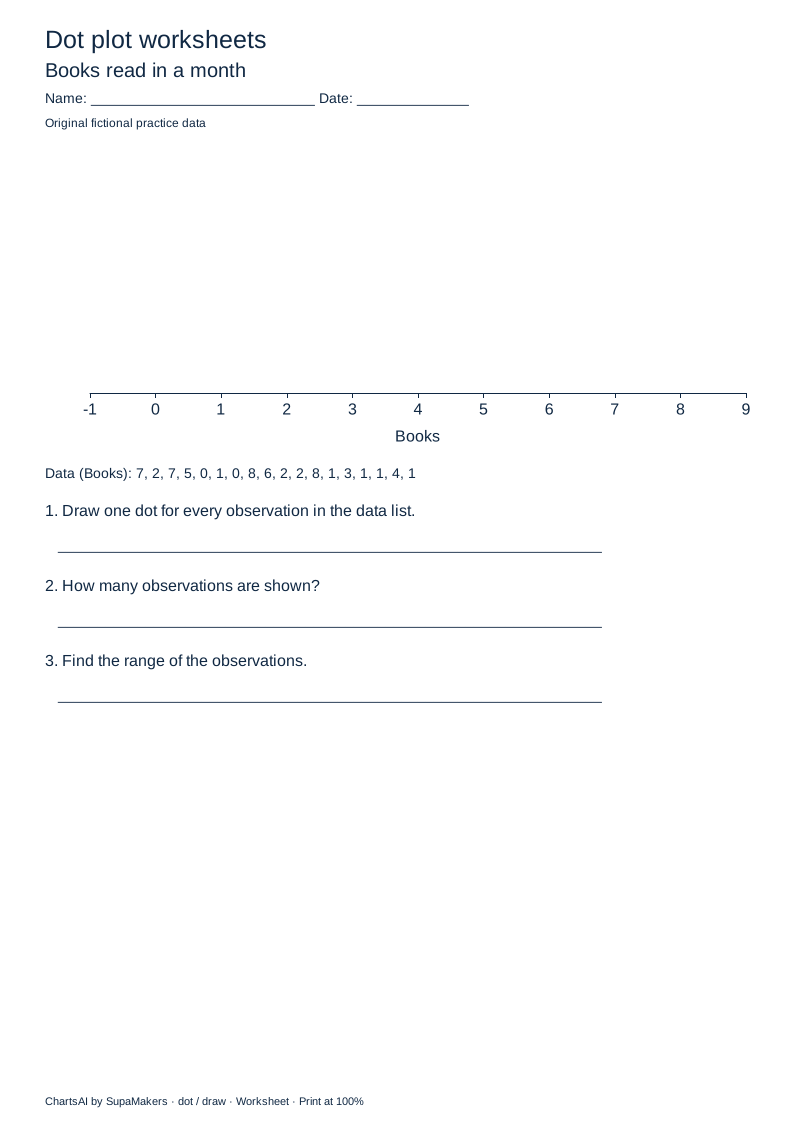
Draw the complete dot plot from a list, check the observation count and find the range. Three tasks include a blank axis and a separate completed graph.
Books read in a month · Books. Observations: 7, 2, 7, 5, 0, 1, 0, 8, 6, 2, 2, 8, 1, 3, 1, 1, 4, 1. These are fictional practice values, not findings or benchmarks.
Every observation is retained, including repeated values. Only the position counts used for stacking are derived. The source CSV stays in the original order.
The median uses sorted observations. For an even count, average the two middle values. The range is maximum minus minimum. Every tied mode is included; if all values occur once, this worksheet uses “no mode”.
Drawing sheets and answer keys share the same minimum, maximum and unit interval. Only the dots are hidden on the question page.
The graph and worksheet use native Apache ECharts axes and marks. Question and answer exports share the same values and scale. PDF pages contain high-resolution images; use the accessible text view or CSV downloads for selectable values and answers. There is no automated grading or curriculum-certification claim.
Yes. Uncheck “Include a separate answer-key page” before downloading a customized PDF. For ready-made packs, print only page 1. The worksheet SVG also contains questions only.
Yes, within the limits above. Choose “Upload a file” or “Paste data”, select the relevant columns, and review before replacing the current values. The imported data and generated files stay in your browser. Replacing a sample removes its fictional-data label.
Yes. Question values, ties, comparisons and worked answers are derived from the current chart data. Changing paper size preserves the dataset. “Generate fresh data” intentionally replaces it with a new fictional practice set.
Yes. Print and share these original worksheets for classroom or home practice, without an account or a watermark across the work. ChartsAI is a free, open-source project by SupaMakers.
Need a standalone graphic or more flexible data? Use the dot plot maker. Explore chart guides, number line worksheets, or bar graph worksheets and line graph worksheets..