The comparison at a glance
| Limitation | Practical response |
|---|---|
| Different units | Define a defensible common rubric |
| Order-dependent shape | Keep order fixed; compare dimensions |
| Overlapping fills | Use fewer series and exact tables |
| Area mistaken for score | Do not rank by polygon area |
| Close values | Consider grouped bars |
Comparable numbers need comparable meaning
A five-axis profile might contain ratings on a shared 0–10 scale. Combining raw revenue, response time and satisfaction on separate unlabeled scales would instead mix unlike measures. Even a shared numeric range does not make the underlying rubric objective. Record how each score was assigned and whether a larger value means better performance on every axis.
Axis order changes the polygon
Consider ratings 10, 10, 1 and 1 on four equally spaced axes. Reordering them to 10, 1, 10 and 1 preserves every rating but changes which large and small values are adjacent. The polygon shape changes even though the per-dimension data do not. Treating filled area as an overall score would therefore introduce an order-dependent quantity.
Overlaps can conceal the comparison
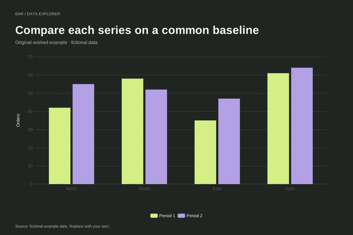
Several filled profiles may obscure one another, particularly where dimensions have similar values. A reader can mistake a prominent shape for a consistently better profile. Reduce the number of series, keep labels clear, and provide the exact score table. If readers need small differences, grouped bars often make those comparisons easier to inspect.
Use a radar for the question it can answer
A radar can help discuss a qualitative profile when dimensions and scales are already understood. It does not calculate a validated composite score, establish a fair benchmark or remove uncertainty in subjective ratings. ChartsAI preserves supplied scores and asks for a shared maximum; it does not silently normalize mixed units into an apparently comparable shape.
A related chart you can inspect
References and reproducibility
The worked arithmetic and teaching examples on this page are original. Background reading: ChartsAI radar method and source. Source code and reuse terms expose the implemented calculations.
Written by SupaMakers for ChartsAI · Reviewed September 8, 2026.