The same three categories, one defined whole
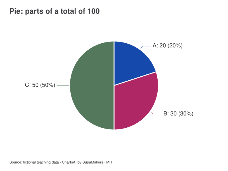
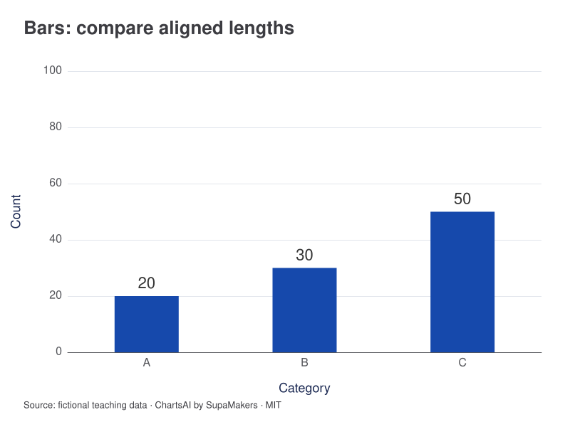
The counts 20, 30 and 50 add to 100. The pie emphasizes that C is half the whole. The bars give A, B and C a shared zero baseline, making the ten-count difference between A and B easier to compare directly.
A = 20%, B = 30%, C = 50%; total = 100.
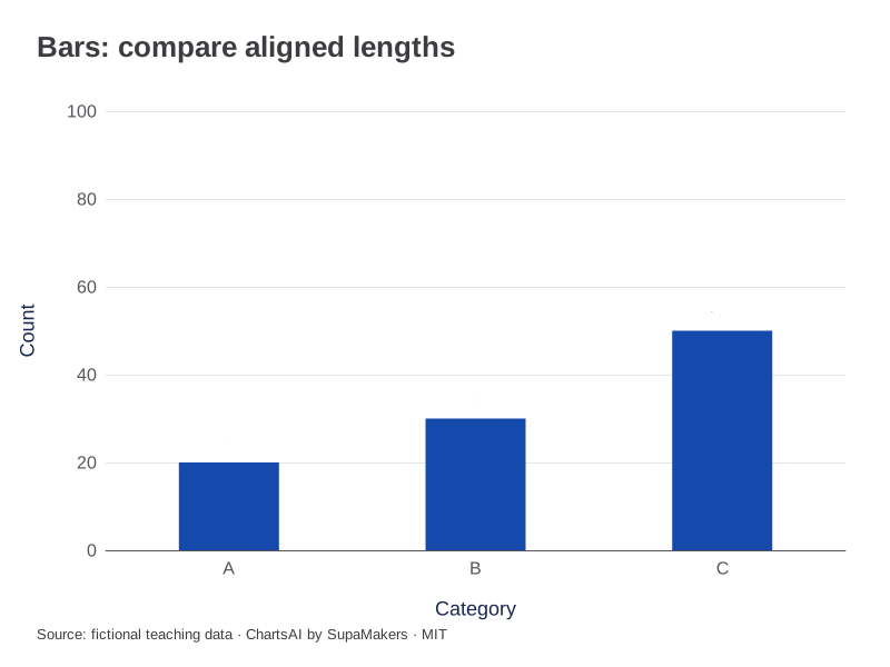
Counts A = 20, B = 30 and C = 50, measured from zero.
Inspect the original data and method
Original fictional counts; mutually exclusive categories that together define this whole. Pie shares are count ÷ 100 × 100%. No negative values, omitted categories or separate denominators. The pie is a downloadable teaching illustration; only the bar view has an interactive maker.
| Category | Count |
|---|---|
| A | 20 |
| B | 30 |
| C | 50 |
Each CSV contains the input for that view. A box-plot CSV adds the same sample label to each observation; it does not substitute quartiles for raw values. Downloaded graphics use the same rendering specification as these previews.
The comparison at a glance
| Condition | Pie | Bars |
|---|---|---|
| One nonnegative whole | Possible | Possible |
| Negative changes | Unsuitable | Diverging bars |
| Many close values | Harder to compare | Shared baseline helps |
| Several groups | Separate pies complicate comparison | Grouped or 100% stacked |
Establish the denominator first
Imagine three fictional counts of 20, 30 and 50. They total 100, so their shares are 20%, 30% and 50%. A pie can represent that whole only if the categories are mutually exclusive and collectively describe the intended total. If respondents can choose several answers, adding selections does not automatically produce a count of people.
Compare the close values
With counts of 31, 33 and 36, all slices would be similar. A sorted bar chart gives each value the same baseline and leaves room for direct labels. The choice is not about decoration: ask whether the reader must identify a dominant share or distinguish small differences among categories. A table can accompany either display for exact values.
Some data cannot form a pie
Negative amounts and a zero total cannot produce valid nonnegative parts of a whole. A diverging bar chart can show signed changes around zero without turning them into positive slices. Several reporting periods also become difficult to compare as separate pies; grouped or percentage-stacked bars may make the question clearer.
Use the available tool honestly
ChartsAI provides an interactive bar maker, including 100% stacked mode. The pie above is a static teaching illustration with the same downloadable counts; there is no interactive pie maker. Use “Edit this view” on the bar graphic to load these exact category counts and preserve a zero baseline.
References and reproducibility
The worked arithmetic and teaching examples on this page are original. Background reading: ONS guidance on axes. Source code and reuse terms expose the implemented calculations.
Written by SupaMakers for ChartsAI · Reviewed September 9, 2026.