The comparison at a glance
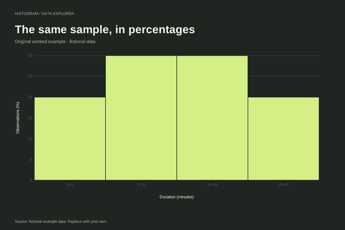
| Interval count | Fraction of 20 | Percentage |
|---|---|---|
| 4 | 0.20 | 20% |
| 6 | 0.30 | 30% |
| 6 | 0.30 | 30% |
| 4 | 0.20 | 20% |
Work from counts and a known denominator
Our twenty-value example has four bins with counts 4, 6, 6 and 4. Dividing by 20 gives 0.20, 0.30, 0.30 and 0.20. Multiplying by 100 gives 20%, 30%, 30% and 20%. The total is 100%, apart from possible rounding in other datasets.
Compare samples carefully
Percentages can make distribution shapes easier to compare when sample sizes differ. They do not make a small sample as informative as a large one. Use the same units, bin boundaries and inclusion rules across charts, and state N for each sample. Otherwise a visual difference may reflect the grouping or sampling rather than the underlying distribution.
Keep density distinct
These bars have equal width five. A bin probability of 0.30 corresponds to density 0.30/5 = 0.06 per unit. A density histogram uses height so area represents probability; this relative-frequency display uses percentage height. Do not relabel its axis as density or infer probability from geometric area without accounting for width.
Retain the original observations
The source CSV keeps all twenty numeric values. The calculated table gives boundaries, counts and percentages together so readers can check the denominator. If the input contains a blank, fix the record or explicitly prepare a documented subset; the tool does not silently change N by dropping incomplete rows.
A related chart you can inspect
References and reproducibility
The worked arithmetic and teaching examples on this page are original. Background reading: NIST histogram background. Source code and reuse terms expose the implemented calculations.
Written by SupaMakers for ChartsAI · Reviewed September 8, 2026.