The same 16 lengths: summary and shape
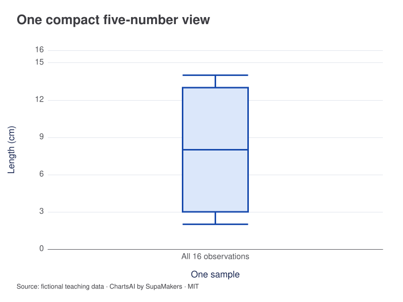
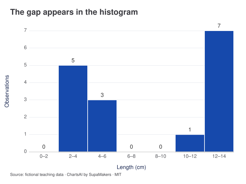
The box plot has Q1 = 3, median = 8 and Q3 = 13 cm. The histogram reveals an empty 6–10 cm span between two concentrations. A five-number summary does not show that gap.
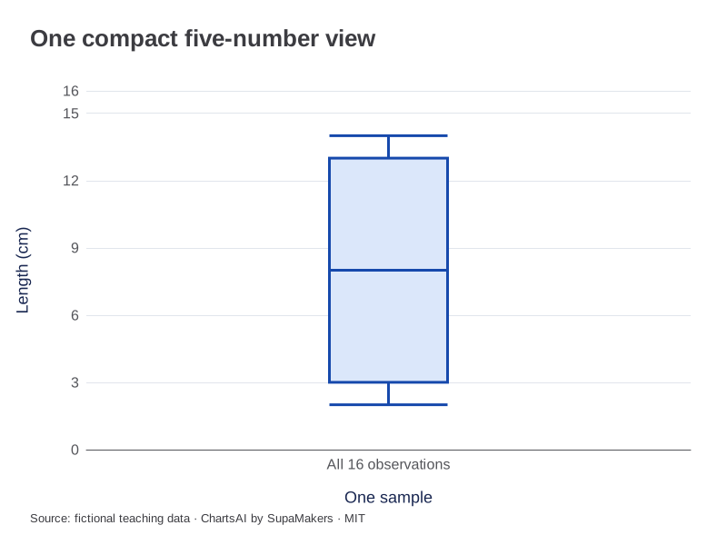
Whiskers 2 and 14; Q1 3; median 8; Q3 13 cm. N = 16.
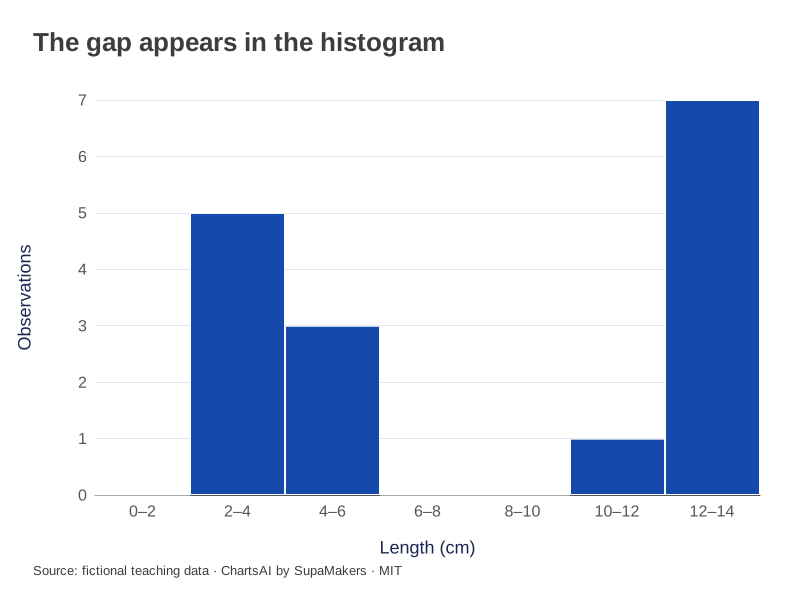
Width 2; start 0. Counts: 0, 5, 3, 0, 0, 1, 7. N = 16.
Inspect the original data and method
No rows removed or pooled with another sample. Quartiles use linear interpolation at (N − 1)p; whiskers end at the most extreme observations within 1.5 IQR. All values fall within those fences. Histogram bins start at 0, have width 2, include the left boundary and exclude the right, except the final bin includes its right boundary.
| Length (cm) |
|---|
| 2 |
| 2 |
| 3 |
| 3 |
| 3 |
| 4 |
| 4 |
| 5 |
| 11 |
| 12 |
| 12 |
| 13 |
| 13 |
| 13 |
| 14 |
| 14 |
Each CSV contains the input for that view. A box-plot CSV adds the same sample label to each observation; it does not substitute quartiles for raw values. Downloaded graphics use the same rendering specification as these previews.
The comparison at a glance
| Feature | Box plot | Histogram |
|---|---|---|
| Centre | Median line | Inferred from grouped shape |
| Spread | IQR and whiskers | Range and concentration of bins |
| Multiple peaks | Usually hidden | Can be visible |
| Key convention | Quartiles and whiskers | Bin width and boundaries |
A compact summary leaves details out
A box plot cannot fully encode peaks, gaps or repeated exact values. Two datasets can share a median and quartiles while having different internal patterns. Our equal-median example gives both groups a median of 10, but their IQRs are 2 and 9. That is already a useful comparison; it still does not show every observation.
Binning reveals a different view
A histogram can expose clusters separated by empty intervals, as in our two-peaks example. Its appearance also depends on bin width and alignment. A very coarse grouping may conceal the gap. When shape matters, compare plausible widths and inspect the raw values rather than relying on one visually convenient version.
Compare like with like
For several groups, box plots use less space and permit side-by-side median and IQR comparisons. State the quartile and whisker conventions, and report each group’s N. When comparing histograms across unequal sample sizes, consistent bins and percentages can help; different widths or raw counts can confound shape with sample size.
Use both when the decision needs both
Begin with a box plot to locate a group with unusual spread, then inspect its histogram or dot plot. This is a complementary workflow rather than a contest with a universal winner. Neither view proves that a group difference is significant or explains what caused it. Preserve the source and calculation settings so the comparison can be reproduced.
References and reproducibility
The worked arithmetic and teaching examples on this page are original. Background reading: NIST histogram background. Source code and reuse terms expose the implemented calculations.
Written by SupaMakers for ChartsAI · Reviewed September 9, 2026.