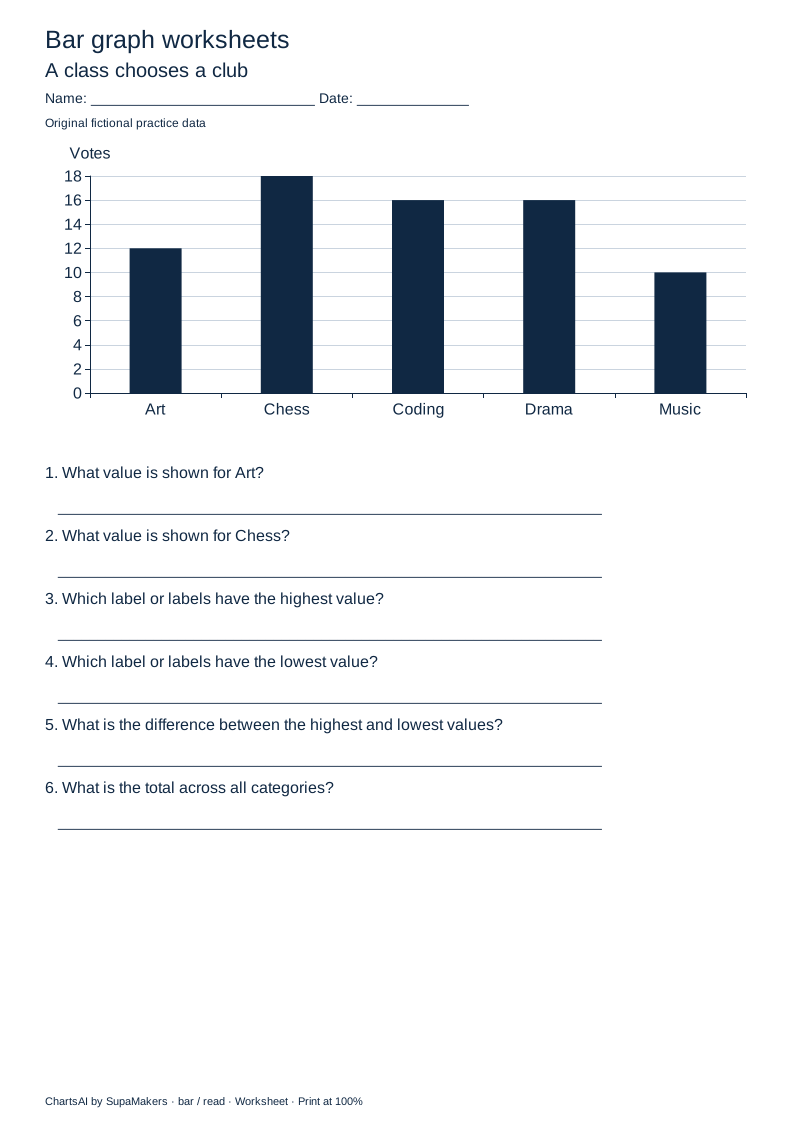
Read the chart
Read category values, identify the highest and lowest values, calculate a difference and total. Six questions use a shared scale.
Read a bar graph, compare categories, or draw bars from a table. Start with a ready-made PDF, or use your own small dataset to generate a worksheet and a separate worked answer key.
Fictional practice data. 5 labelled values.
Select one label column and one value column, with 3–8 rows and whole numbers from 0 to 100.
Question page · Print at actual size (100%). Updating preview…
A class chooses a club · Votes. Labels are equally spaced and stay in the supplied order.
| Label | Votes |
|---|---|
| Art | 12 |
| Chess | 18 |
| Coding | 16 |
| Drama | 16 |
| Music | 10 |
Question downloads always hide answers, even when you preview the key. PDFs contain high-resolution page images.
A bar graph compares values across categories. Each bar starts at zero and its length represents the category value. Read the labelled scale before comparing heights.
Use 3–8 distinct category labels, each up to 18 characters, with one whole-number value from 0 to 100 per category. Choose exactly one value column. Repeated category names are rejected rather than combined.
Original fictional examples. Each PDF contains one question page and one answer-key page. Download without signing in or enabling JavaScript.
Read category values, identify the highest and lowest values, calculate a difference and total. Six questions use a shared scale.
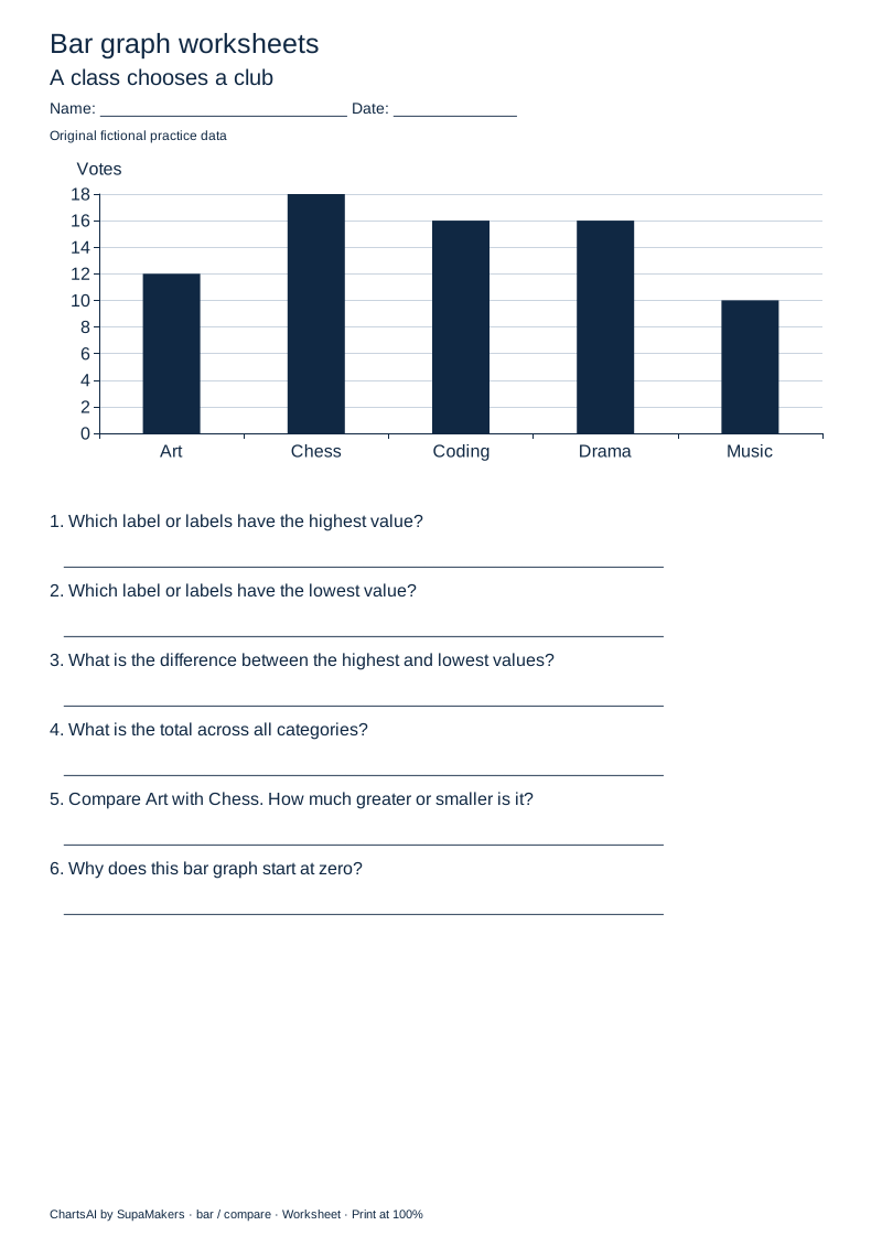
Compare categories, include ties, calculate differences and explain the zero baseline. Six questions connect calculations to visual interpretation.
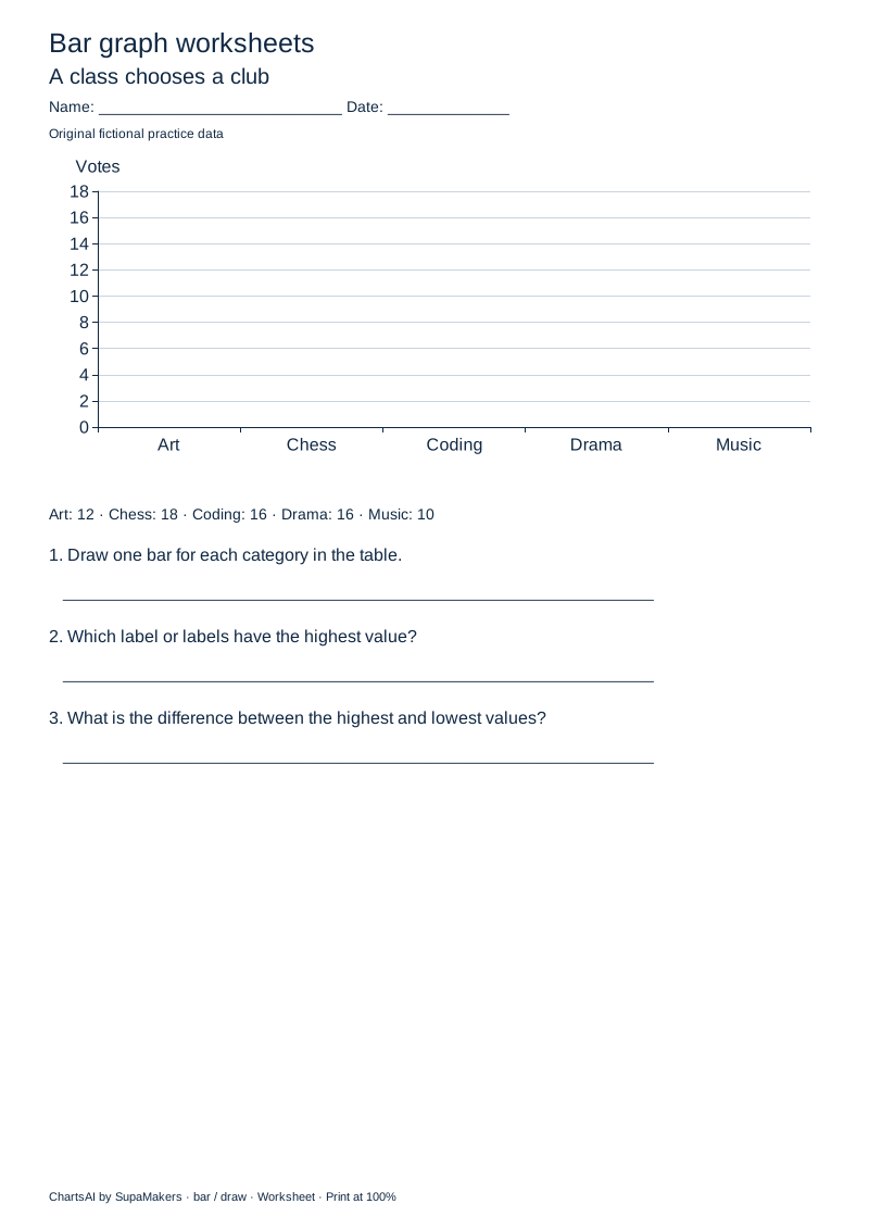
Use a source table to draw bars on a labelled blank grid, then identify the highest value and the range. Three tasks with a completed answer graph.
A class chooses a club · Votes. Art: 12; Chess: 18; Coding: 16; Drama: 16; Music: 10. These are fictional practice values, not findings or benchmarks.
Bars preserve the supplied category order and always include zero. Whole-number tick spacing is selected from 1, 2, 5 or 10 so the printed scale remains readable.
Largest and smallest answers include all tied labels. Differences subtract smaller from larger; the total adds all supplied category values. No missing value becomes zero.
The default data are fictional votes for clubs. For custom datasets, use categories whose values can meaningfully be totalled; a sum of percentages, averages or overlapping groups may not be meaningful.
The graph and worksheet use native Apache ECharts axes and marks. Question and answer exports share the same values and scale. PDF pages contain high-resolution images; use the accessible text view or CSV downloads for selectable values and answers. There is no automated grading or curriculum-certification claim.
Yes. Uncheck “Include a separate answer-key page” before downloading a customized PDF. For ready-made packs, print only page 1. The worksheet SVG also contains questions only.
Yes, within the limits above. Choose “Upload a file” or “Paste data”, select the relevant columns, and review before replacing the current values. The imported data and generated files stay in your browser. Replacing a sample removes its fictional-data label.
Yes. Question values, ties, comparisons and worked answers are derived from the current chart data. Changing paper size preserves the dataset. “Generate fresh data” intentionally replaces it with a new fictional practice set.
Yes. Print and share these original worksheets for classroom or home practice, without an account or a watermark across the work. ChartsAI is a free, open-source project by SupaMakers.
Need a standalone graphic or more flexible data? Use the bar chart maker. Explore chart guides, number line worksheets, or dot plot worksheets and line graph worksheets..